Cooper Tires
Branding, Graphic Design, Art Direction, Interface Design, Motion Design, Integrated Brand Tools
Project Details
Cooper has spent more than a century perfecting the industry's toughest tires. The product was exceptional; but the brand no longer reflected it. In a crowded global market, Cooper had started to blend in, and the identity needed to work as hard as the tire.
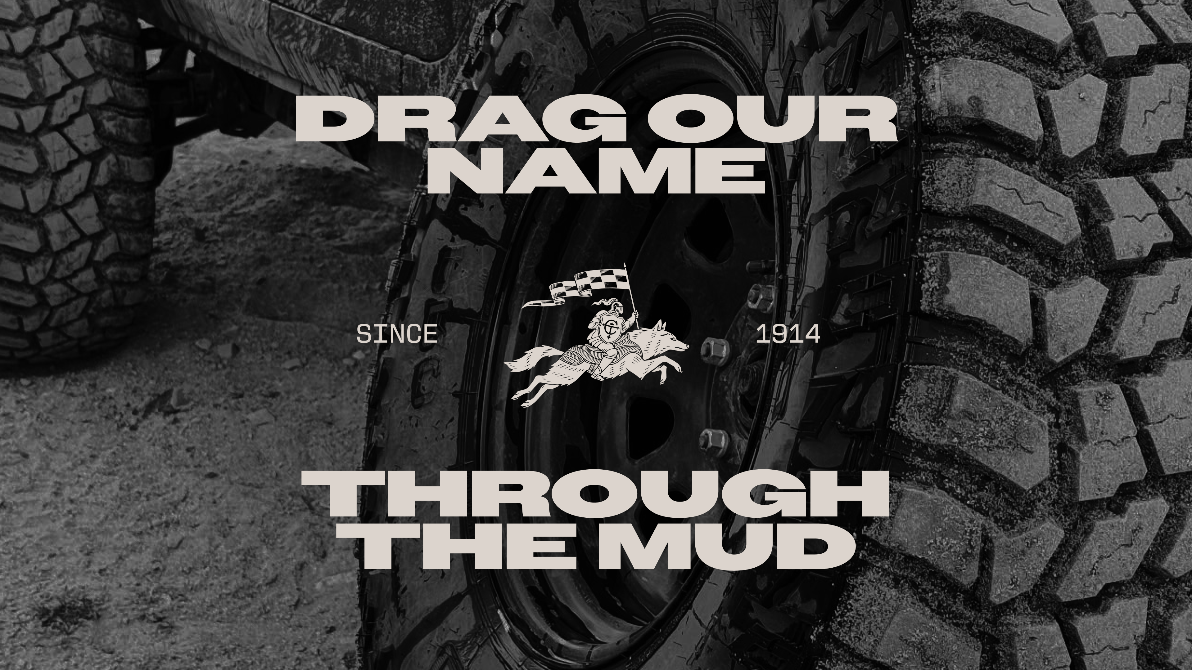
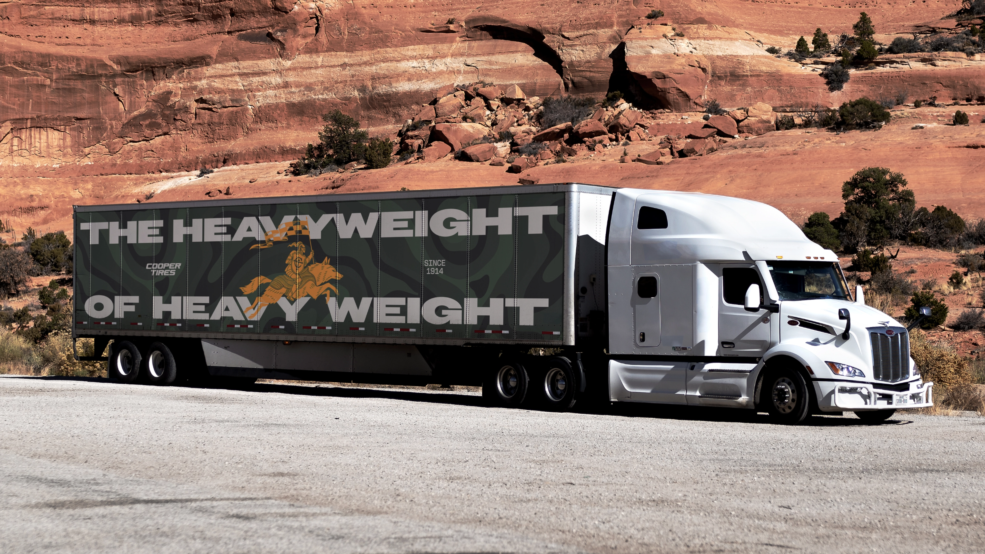
So we rebuilt the brand from the thing that earned Cooper’s reputation in the first place: the product itself. We led with the toughest expression of it, Cooper’s all-terrain tires, and let that toughness cast a halo across the range. Every decision, from the mark to the type to the color, traces back to the tire, where it came from, where it is, and where it’s going (off the road and into the wild).
A heritage brand, rebuilt from its own product, and made unmistakably Cooper.
Credits
Head of Design: Ryan Atkinson
Design Director: Joanna Durkalec, Flick Eriksson
Designers: Elaine Li, Jin Kim, Adolfo Gutierrez
Illustration: Marco Palmieri
Animators: Elaine Li, Lucy Hsiung
Visualization: Elaine Li, Joanna Durkalec, Tomas Molla
GCD, Art Direction: Felipe Pavani
GCD, Copywriting: Alanna Watson
Copywriters: Greg Bruce, Alanna Watson
Art Directors: Jack Graham, Felipe Pavani
Client Lead & CMO: Lindsey McNabb Hover
Client Team: Lauren Andreassi, Prerna Agarwal
Project Management: Emma Carte
Producers: Kimberly Kietz
Strategy: Rik Mistry, Harry Guild, Yewande Adigun
COOPER TIRES
Cooper has spent more than a century engineering some of the industry’s toughest tires, but its brand no longer reflected the strength of its product. We rebuilt the identity from the tire itself—drawing on its form, performance and heritage—to create a distinctive brand system that captures Cooper’s rugged spirit and re-establishes it as a brand built for where the road ends.
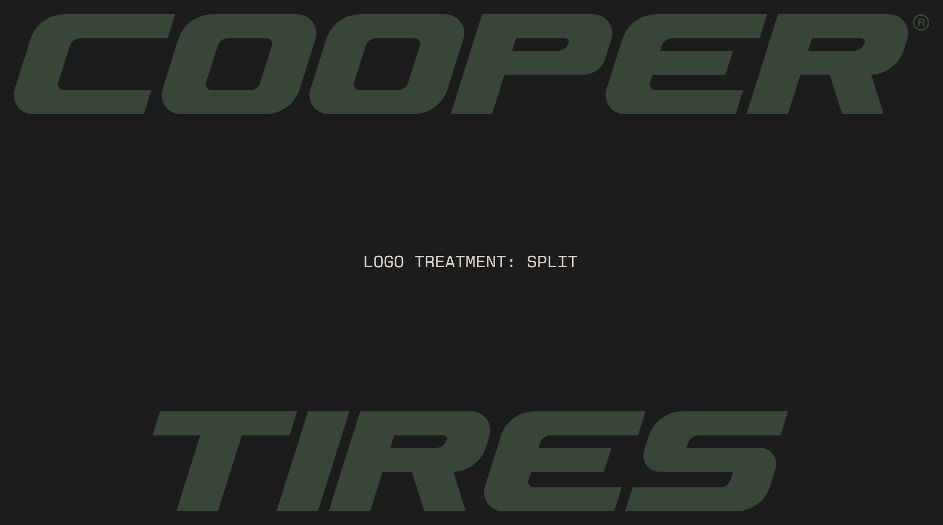
WORDMARK
The Cooper wordmark has been stamped into tire sidewalls for decades. Replacing every mold across every product would take years, so preserving that equity wasn't just a branding decision, it was a practical one. Rather than creating a new logo, we refined it, sharpening its geometry with cues drawn from the tread to create a mark that feels stronger and more engineered while staying compatible with the products already on the road.
THE WORDMARK
The Cooper wordmark has been stamped into tire sidewalls for decades. Replacing every mold across every product would take years, so preserving that equity wasn't just a branding decision, it was a practical one. Rather than creating a new logo, we refined it, sharpening its geometry with cues drawn from the tread to create a mark that feels stronger and more engineered while staying compatible with the products already on the road.



THE HELM
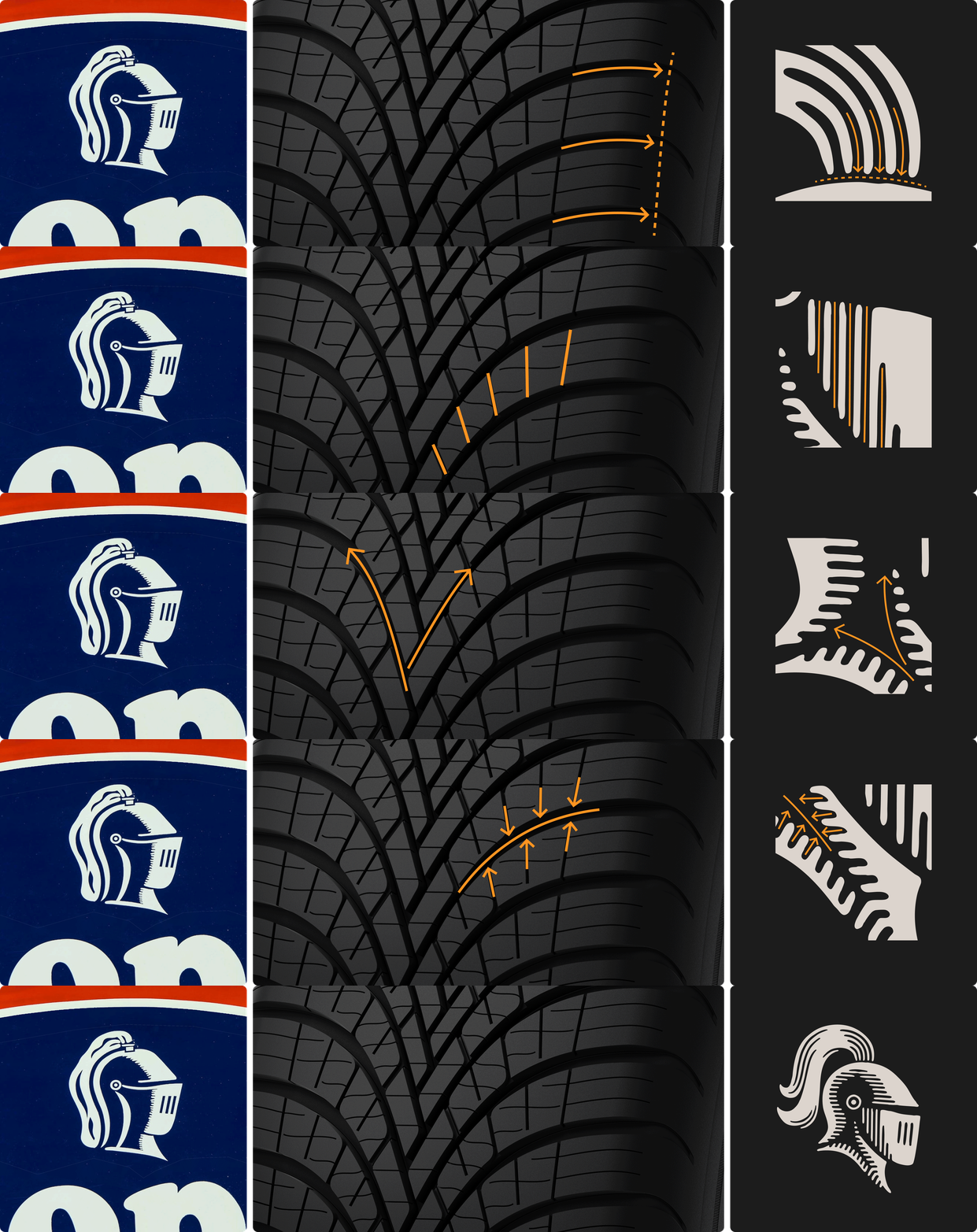
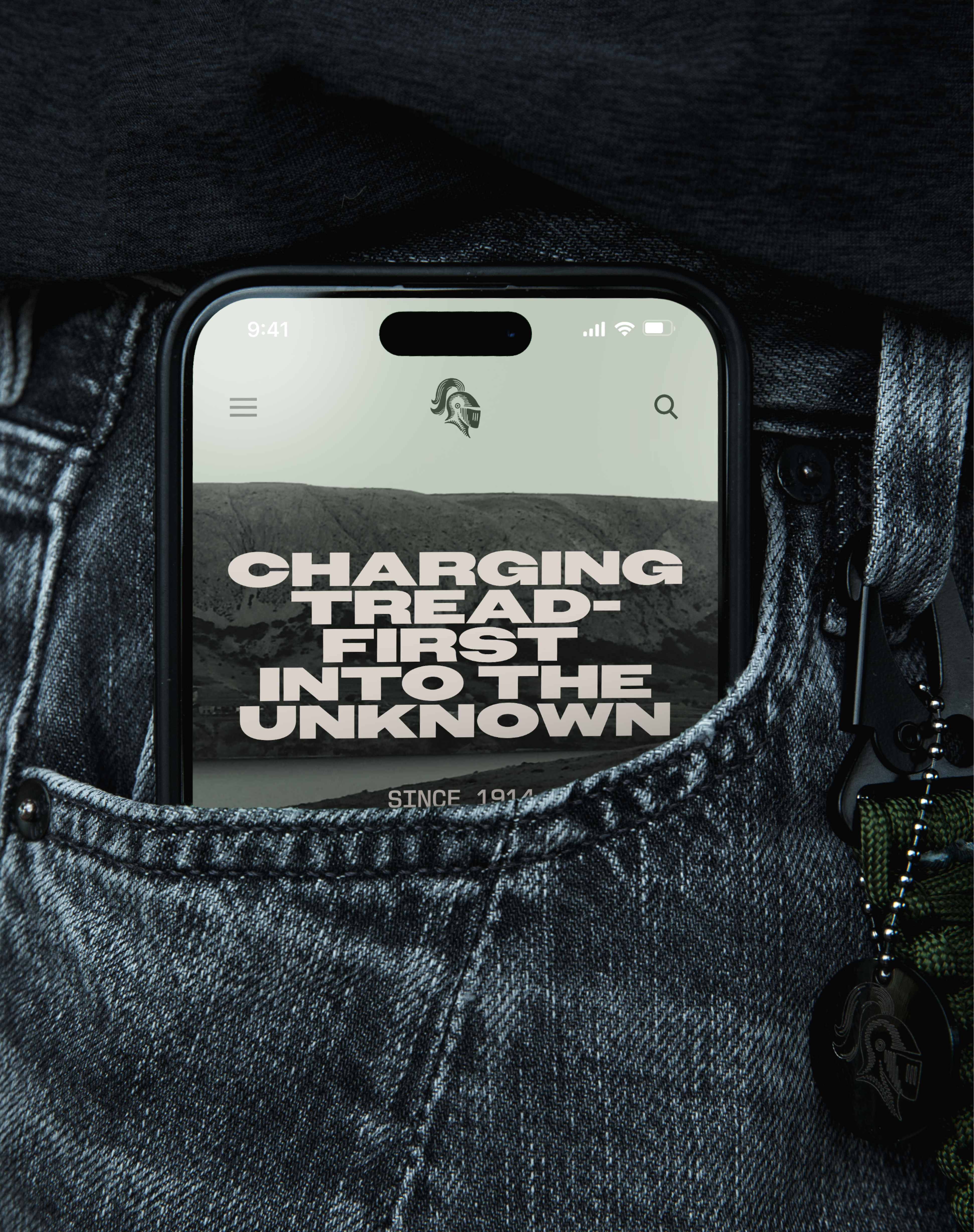
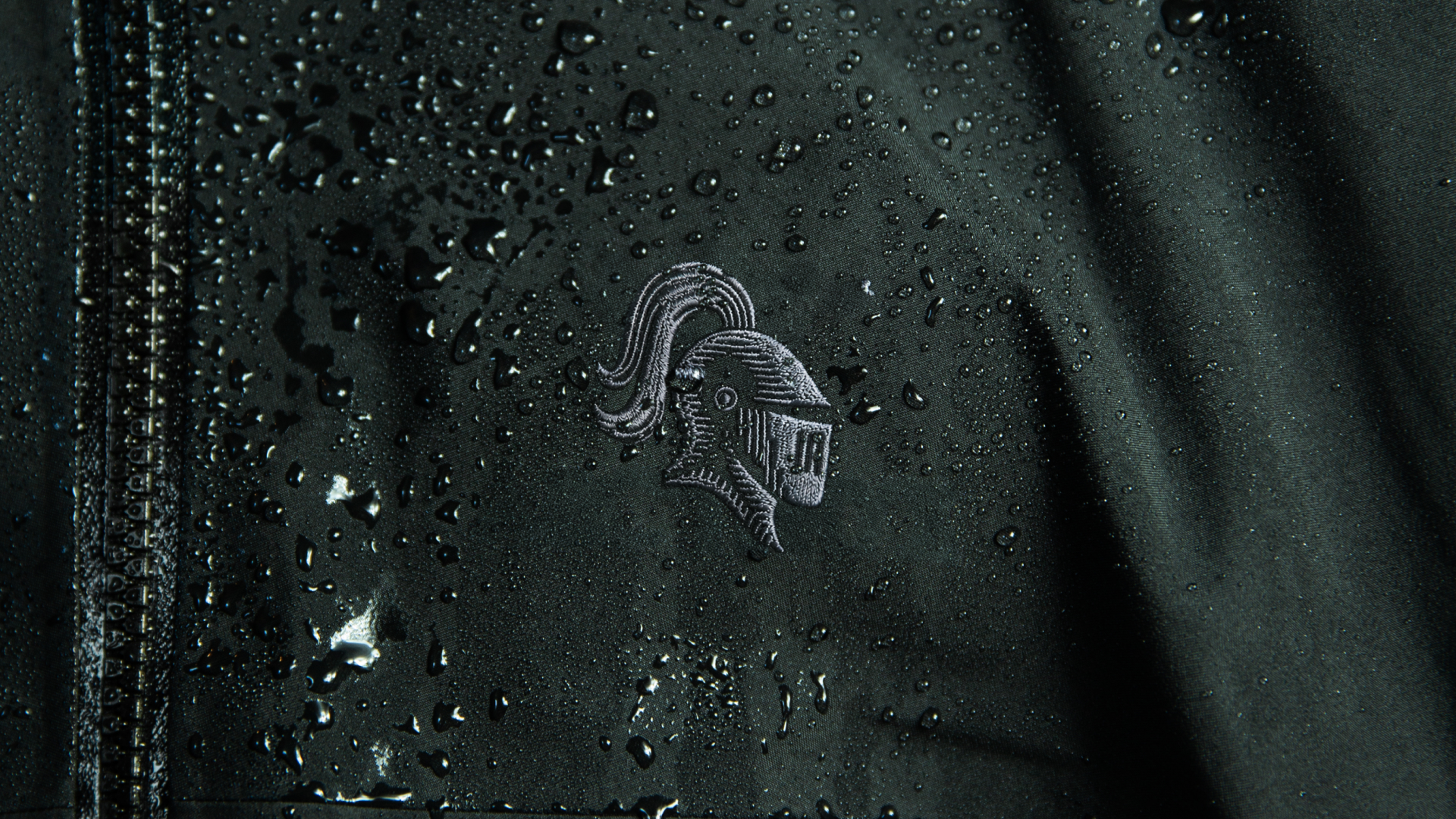
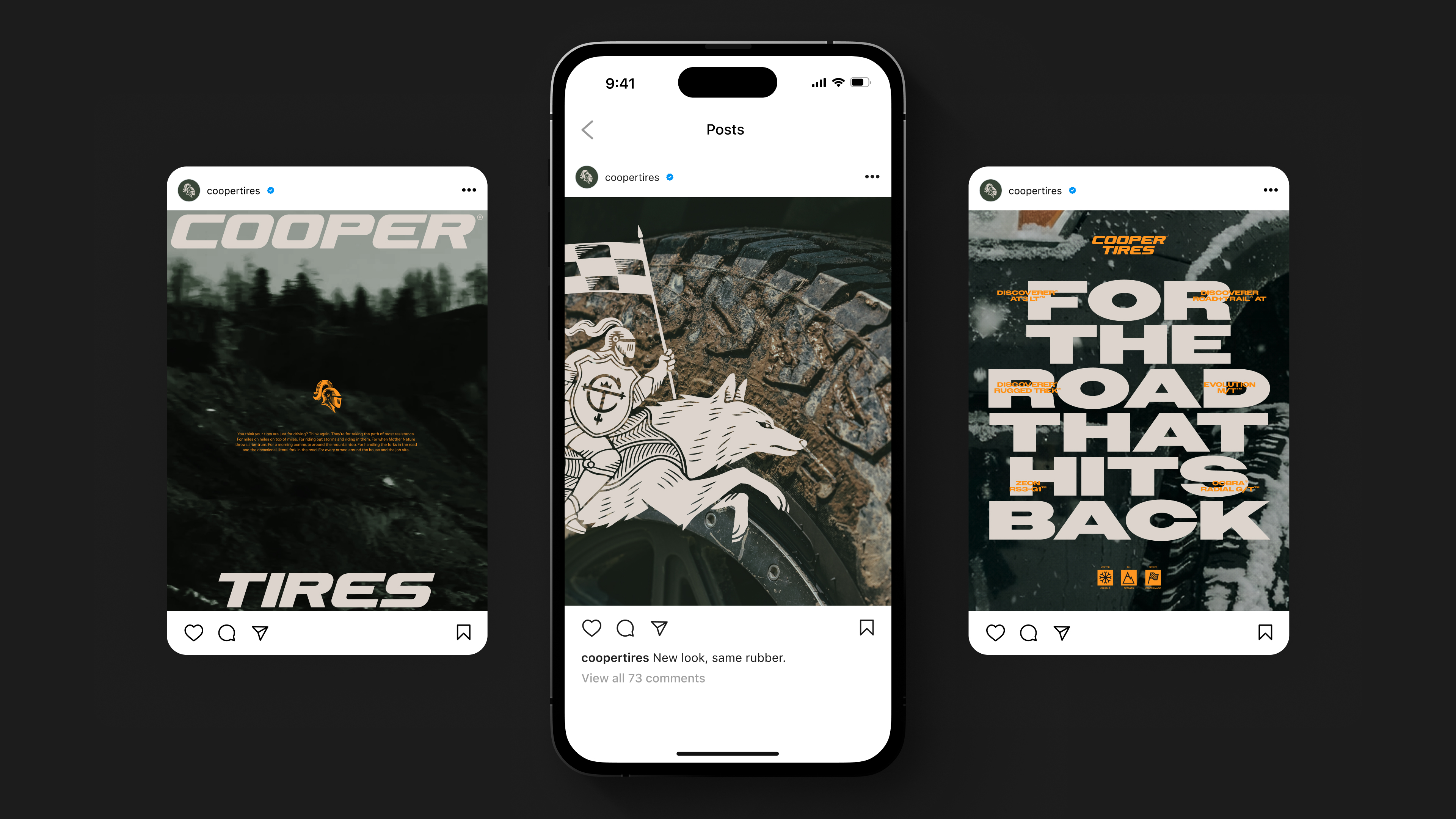
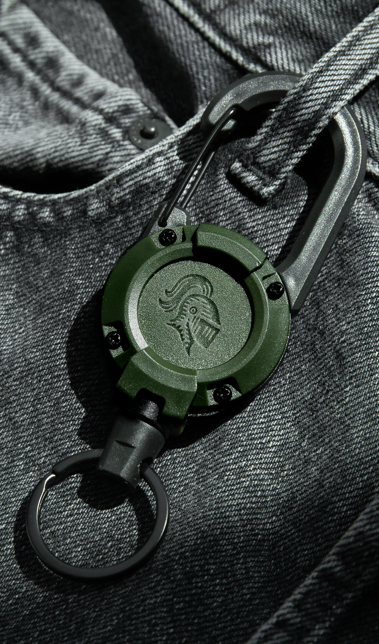
In the 1940s, Cooper introduced the Armored Cord tire, a tire so tough and so successful that it inspired the knight's helm that would define the company for decades. In 2003, that helm was retired and replaced with a generic oval.
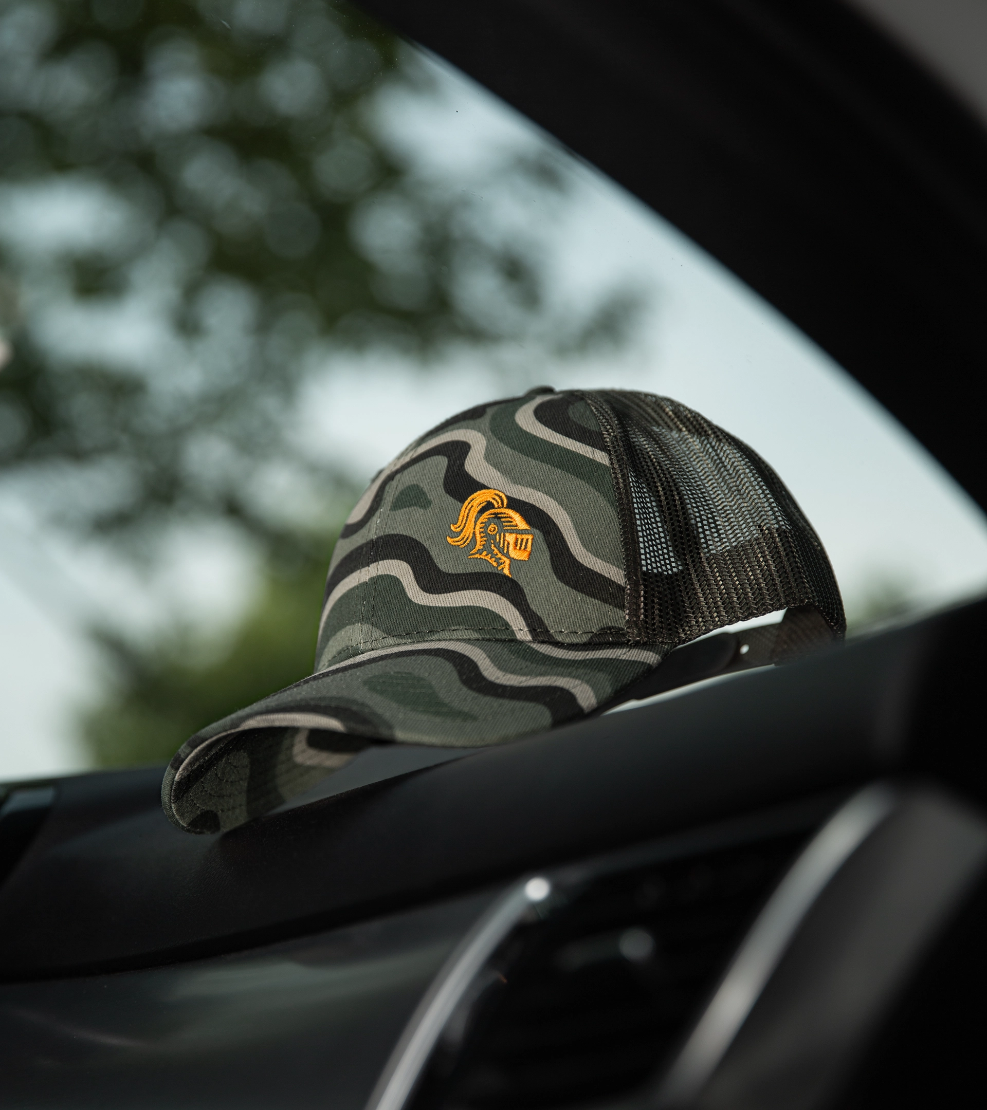
We brought the helm back. The new helm respects the form of the original, but its line work draws from tread design and directional grooves, letting the same language that gives the tire its performance shape the brand's most recognizable symbol.
THE HELM
In the 1940s, Cooper introduced the Armored Cord tire, a tire so tough and so successful that it inspired the knight's helm that would define the company for decades. In 2003, that helm was retired and replaced with a generic oval.
We brought the helm back. The new helm respects the form of the original, but its line work draws from tread design and directional grooves, letting the same language that gives the tire its performance shape the brand's most recognizable symbol.


THE KNIGHT & WOLF
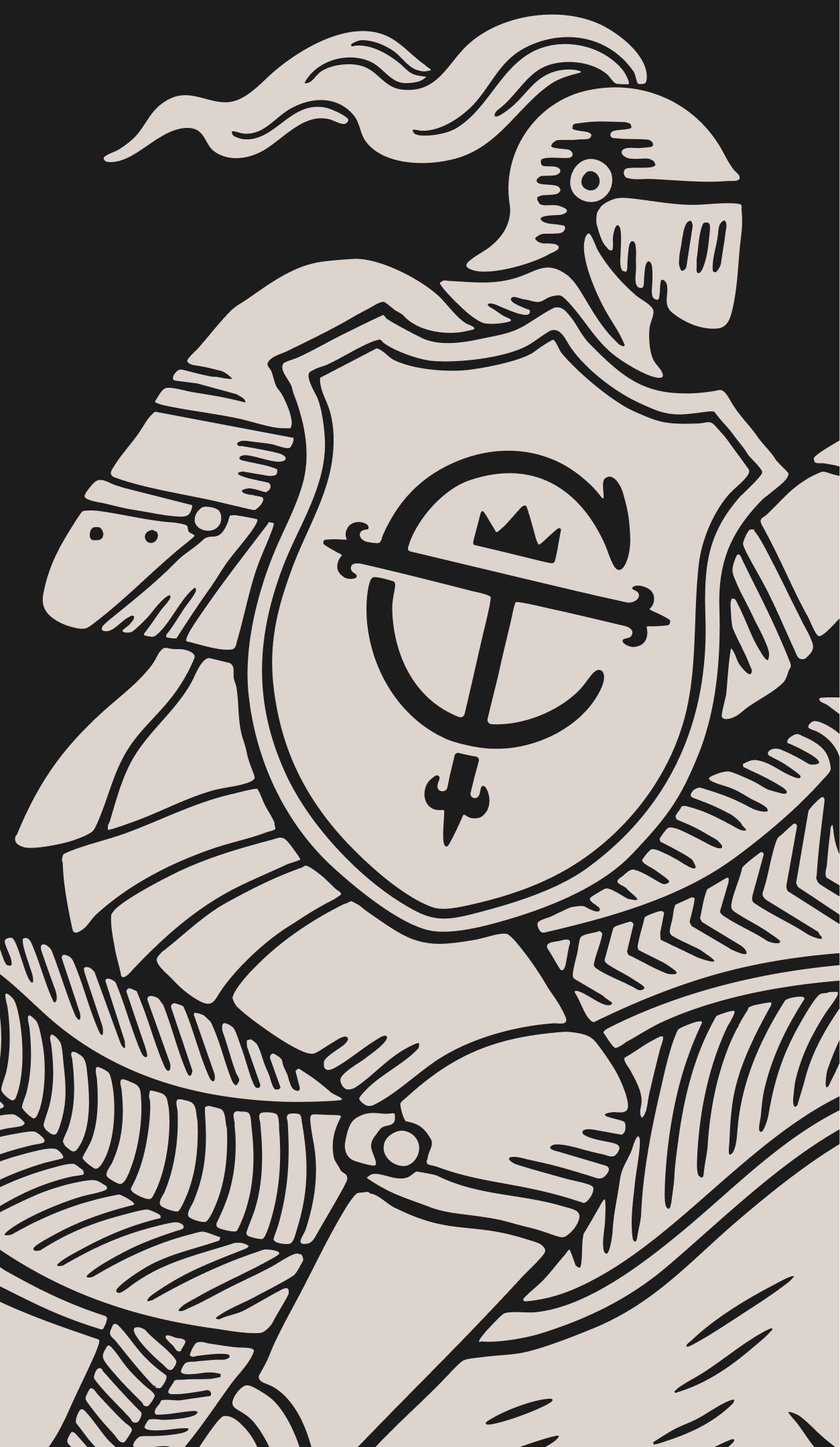
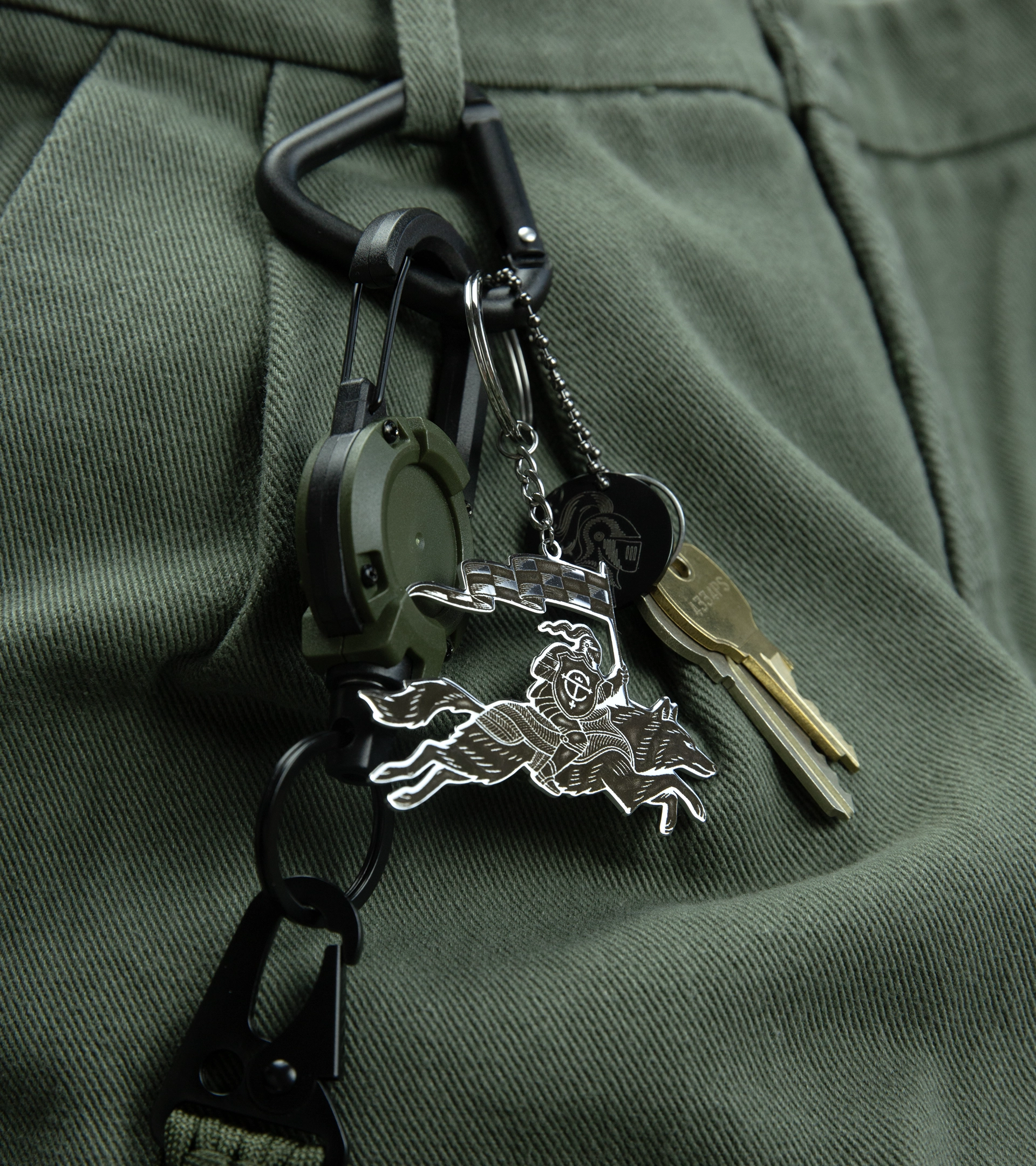
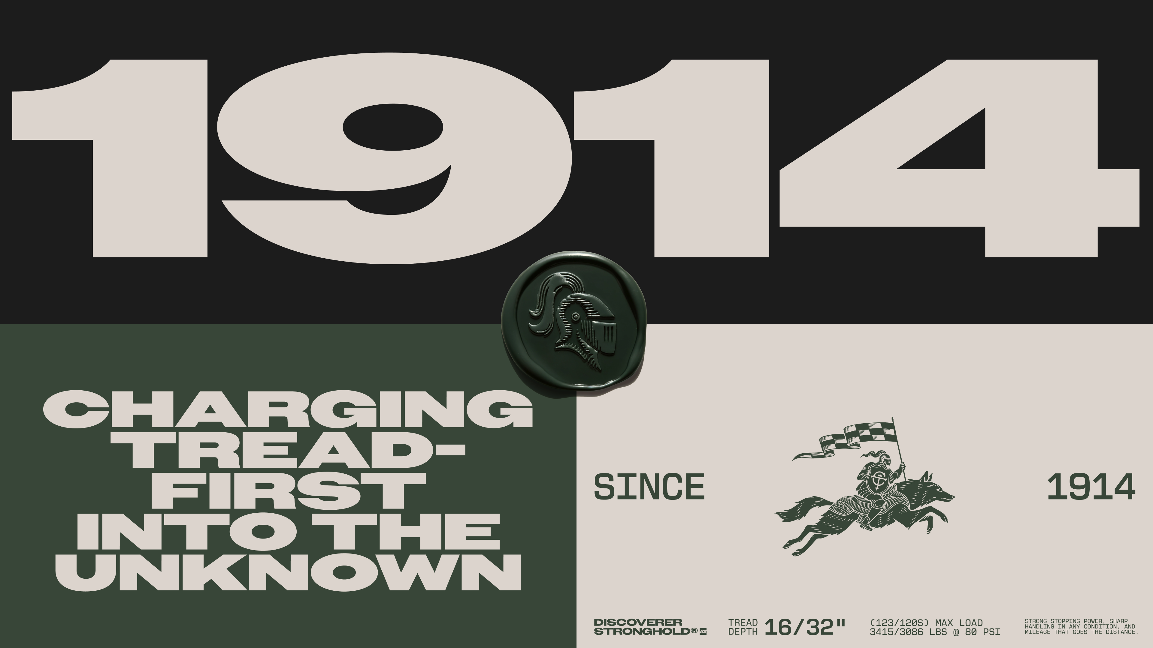
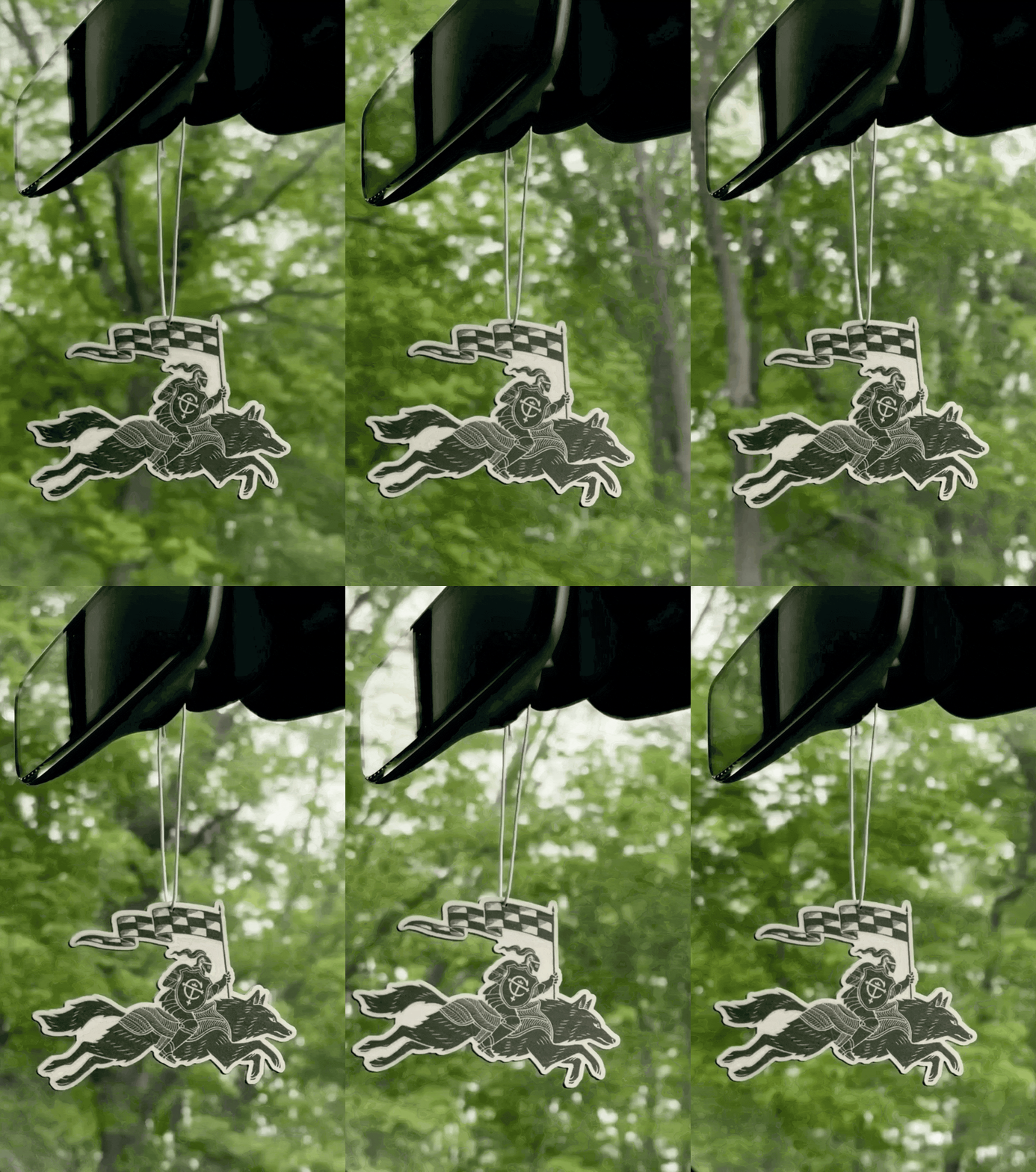
A brand needs both a signifier and a behavior, and we found both in the tire. The helm became Cooper's signifier, a badge forged through generations of engineering. The wolf became its behavior, bringing movement, putting the knight in motion and carrying the energy of the tire into the brand.
Native to Ohio where Cooper was founded, the wolf wears armor made from tread, tying product to brand in a single figure. Together the knight and wolf connect story and system, the symbol people remember and the behavior the brand lives by.
THE KNIGHT & WOLF
A brand needs both a signifier and a behavior, and we found both in the tire. The helm became Cooper's signifier, a badge forged through generations of engineering. The wolf became its behavior, bringing movement, putting the knight in motion and carrying the energy of the tire into the brand.
Native to Ohio where Cooper was founded, the wolf wears armor made from tread, tying product to brand in a single figure. Together the knight and wolf connect story and system, the symbol people remember and the behavior the brand lives by.


BRAND COLOR
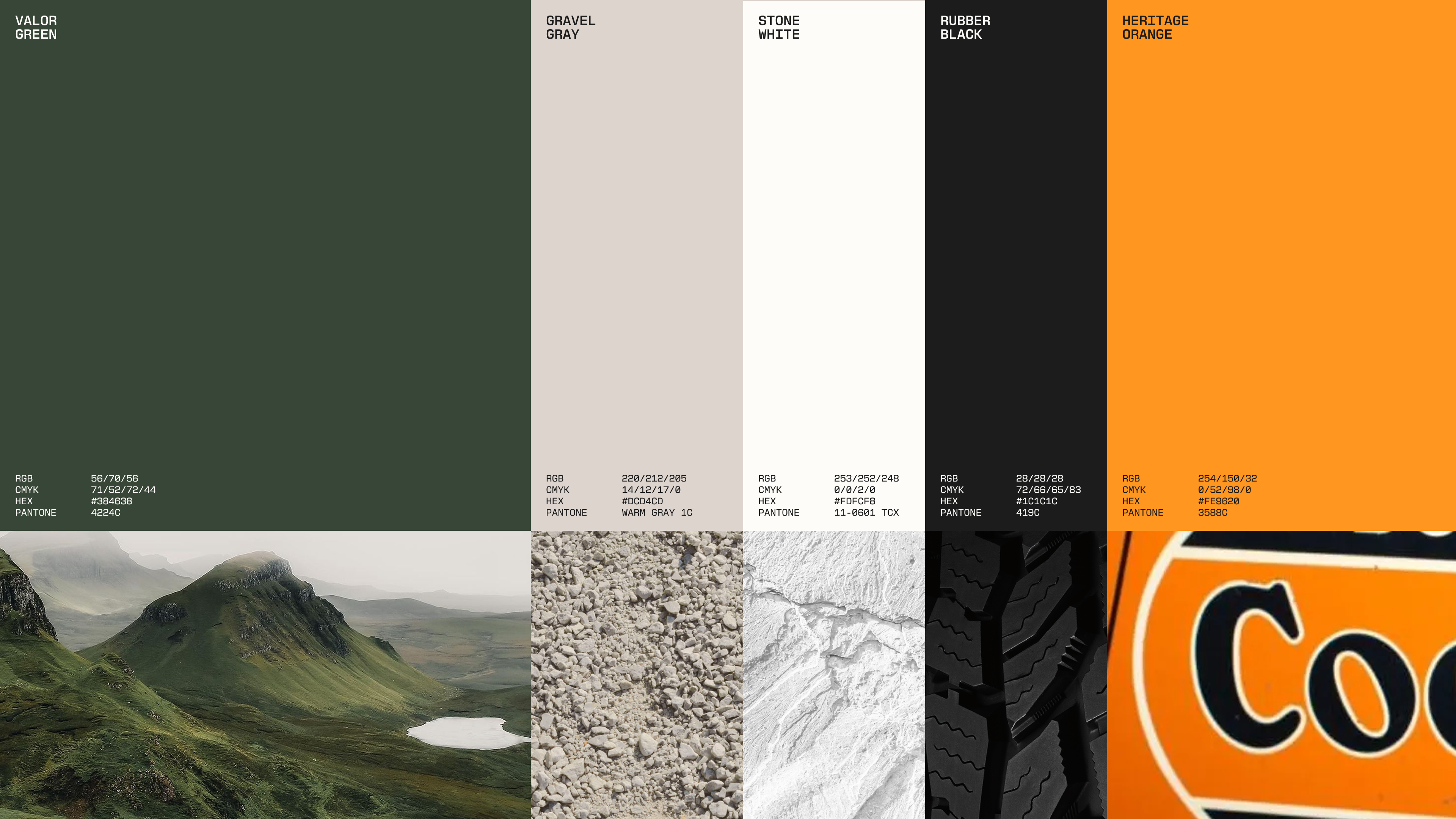
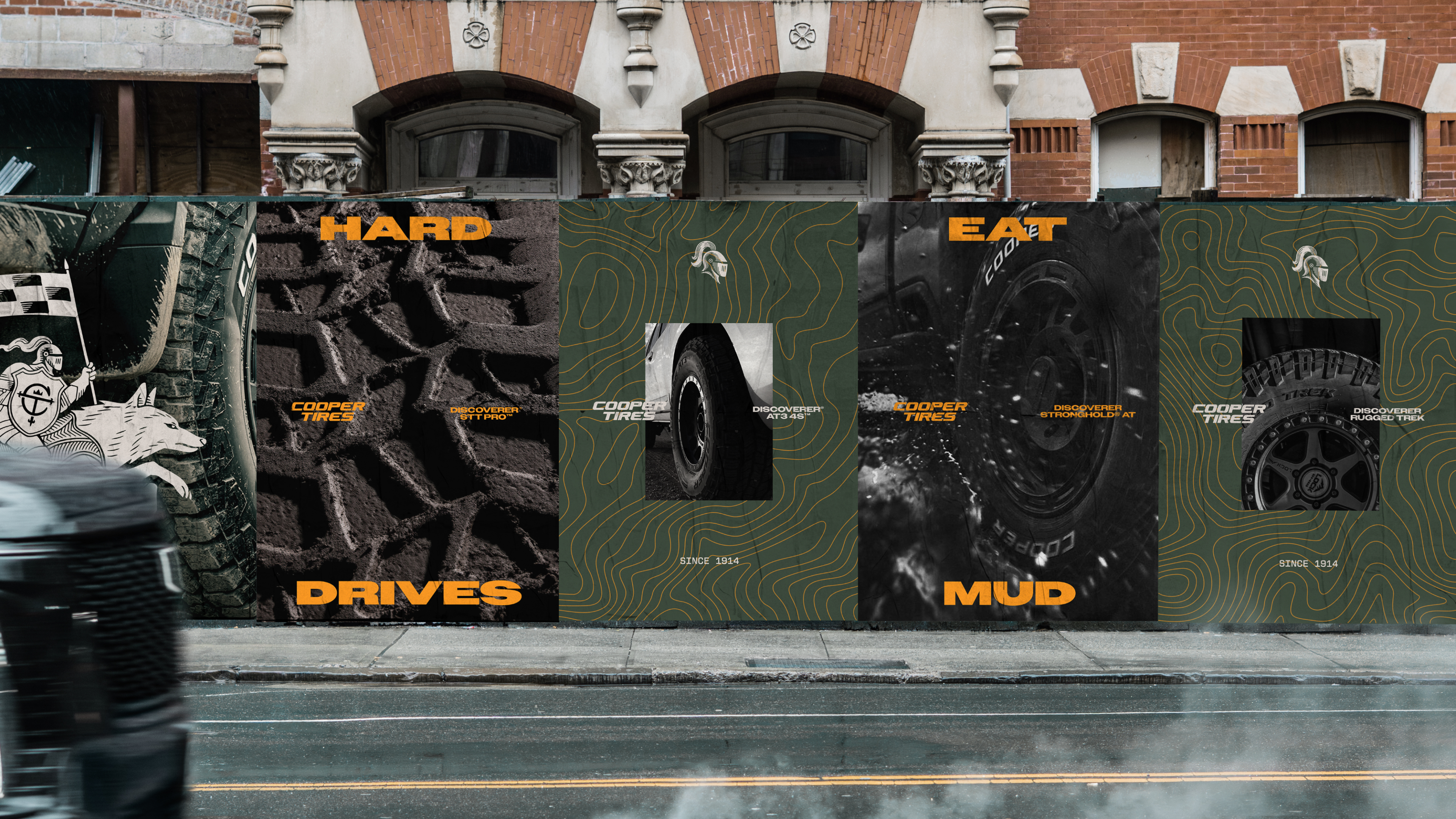
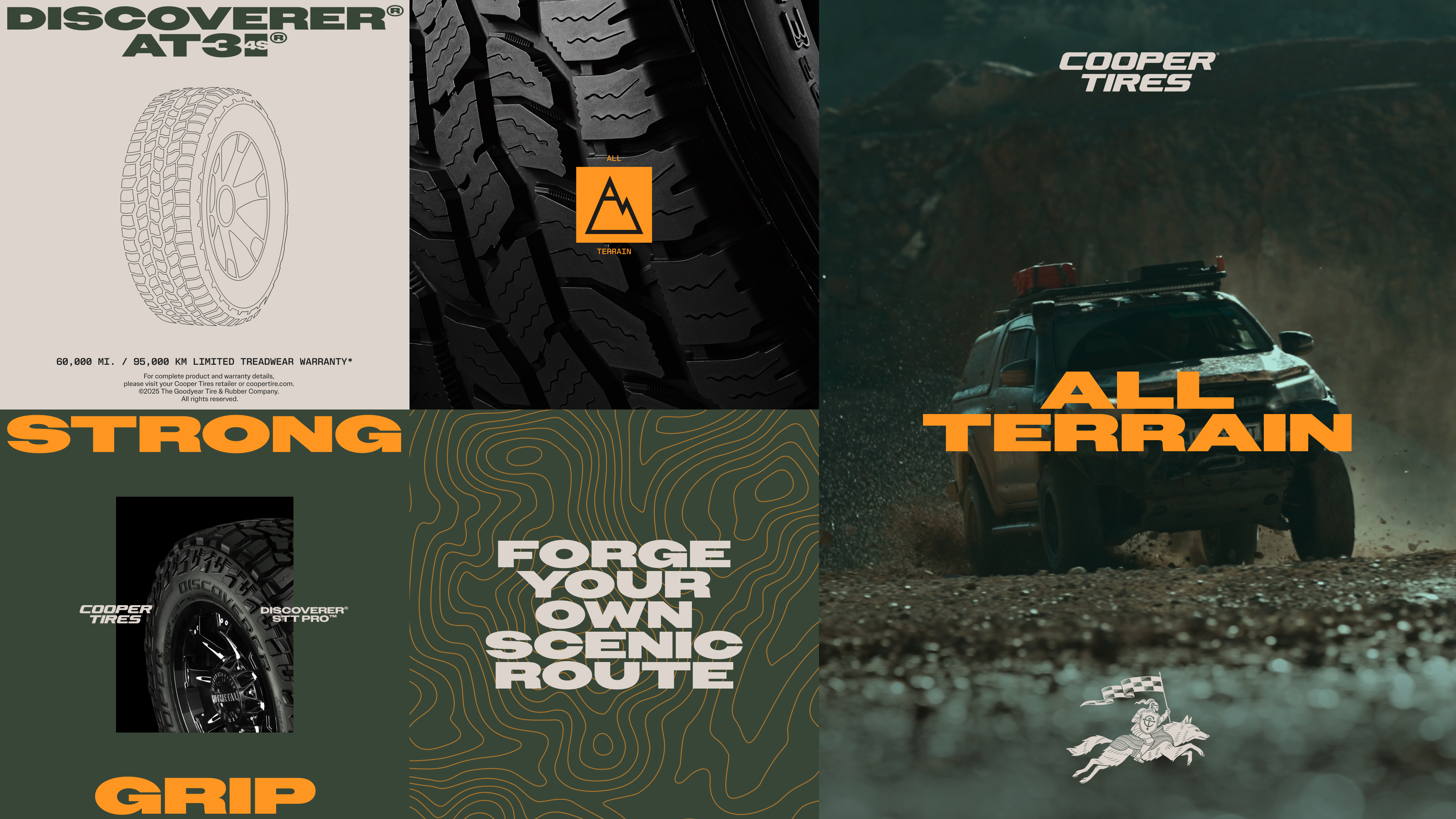
Cooper had been living in a sea of corporate blue, indistinguishable from the rest of the category. Moving to Valor Green became one of the brand's biggest strategic shifts, pointing to exactly where its toughest all-terrain tires are made to go: off the road and into the wild.
Supporting tones of gravel grey, stone white, and rubber black build an earthy palette around it, while Heritage Orange returns as a punchy accent, connecting the new identity to Cooper's early history while adding energy across the system.
BRAND COLOR
Cooper had been living in a sea of corporate blue, indistinguishable from the rest of the category. Moving to Valor Green became one of the brand's biggest strategic shifts, pointing to exactly where its toughest all-terrain tires are made to go: off the road and into the wild.
Supporting tones of gravel grey, stone white, and rubber black build an earthy palette around it, while Heritage Orange returns as a punchy accent, connecting the new identity to Cooper's early history while adding energy across the system.
TYPOGRAPHY
Cooper’s typography balances two defining qualities: confidence and engineering.
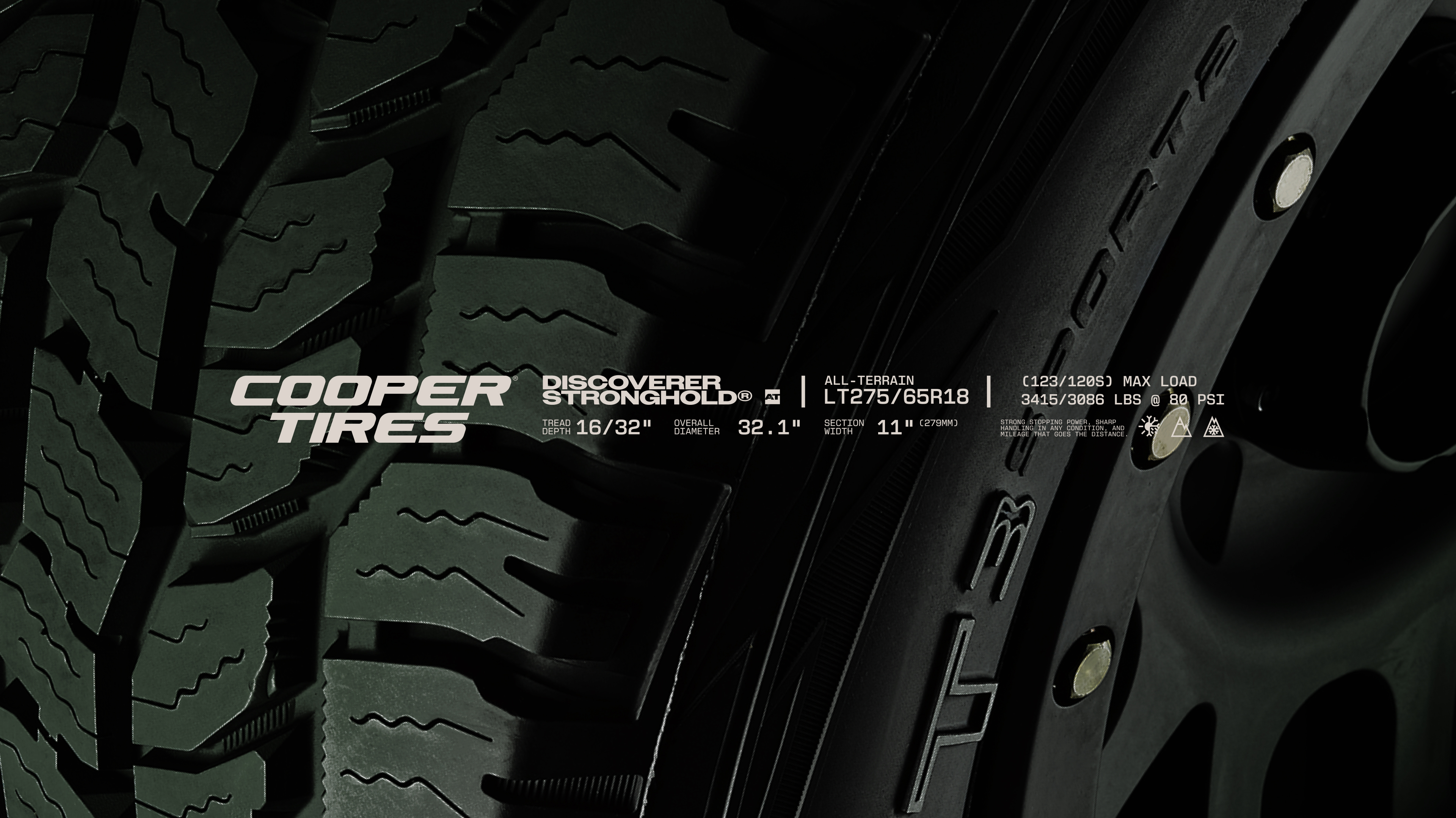
Owners, a bold extended display face, echoes the proportions of the Cooper wordmark, giving the brand a strong presence wherever it appears. It's paired with New Science Mono, drawn from the technical markings found on every Cooper tire, so specifications, measurements, and engineering details become part of the visual language.
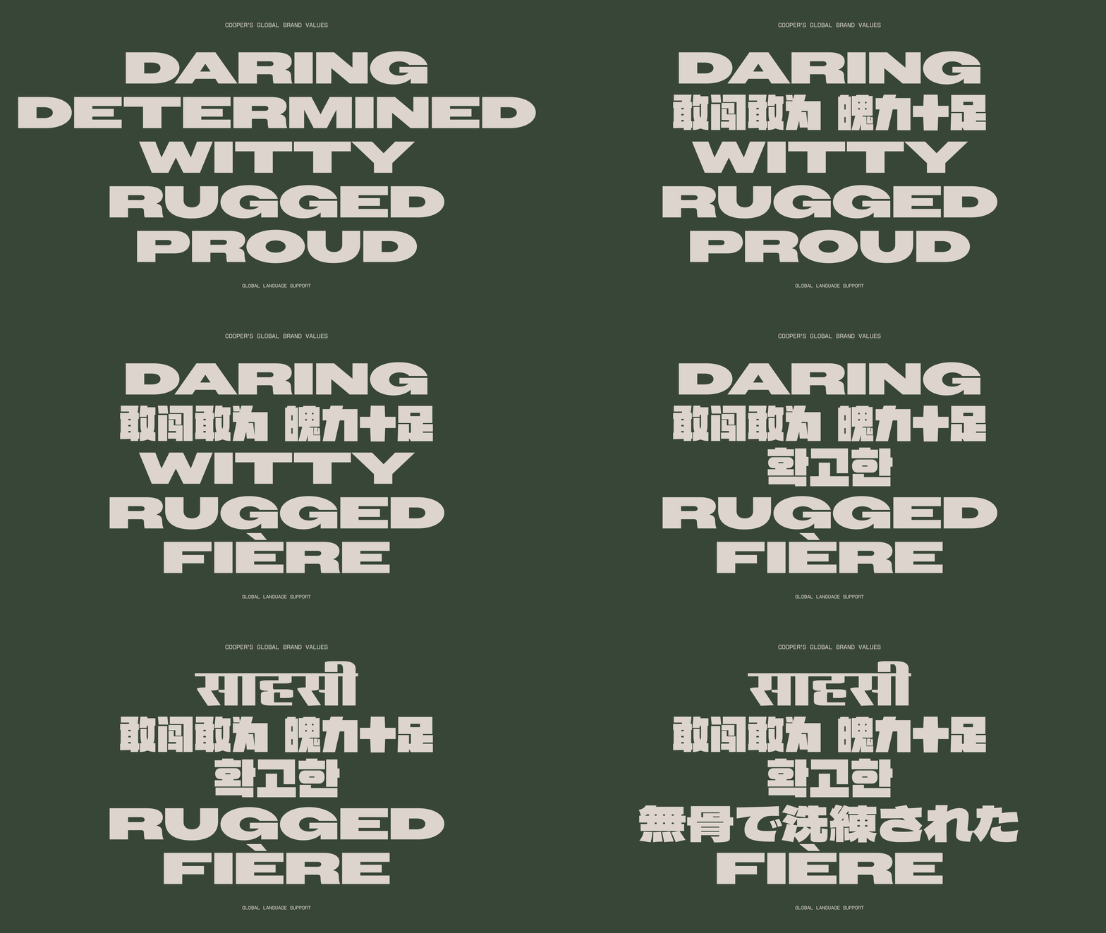
Working with partners across our global network, we also curated a set of non-Latin typefaces, keeping it consistent and recognizable in every market.
TYPOGRAPHY
Cooper’s typography balances two defining qualities: confidence and engineering.
Owners, a bold extended display face, echoes the proportions of the Cooper wordmark, giving the brand a strong presence wherever it appears. It's paired with New Science Mono, drawn from the technical markings found on every Cooper tire, so specifications, measurements, and engineering details become part of the visual language.
Working with partners across our global network, we also curated a set of non-Latin typefaces, keeping it consistent and recognizable in every market.

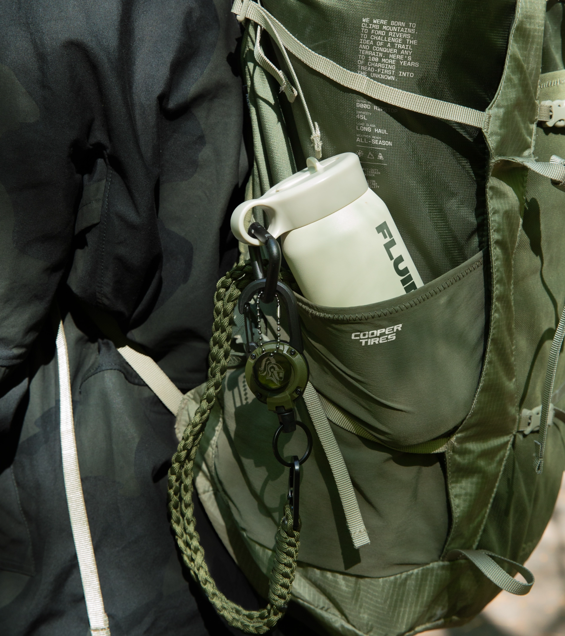
EXPRESSIVE ICONOGRAPHY
Built with the same crafted character as the helm and wolf, the icons combine utility with wit, turning product stories, heritage, and engineering details into small moments of discovery, each one drawn from the same visual language as everything else.
EXPRESSIVE ICONOGRAPHY
Built with the same crafted character as the helm and wolf, the icons combine utility with wit, turning product stories, heritage, and engineering details into small moments of discovery, each one drawn from the same visual language as everything else.




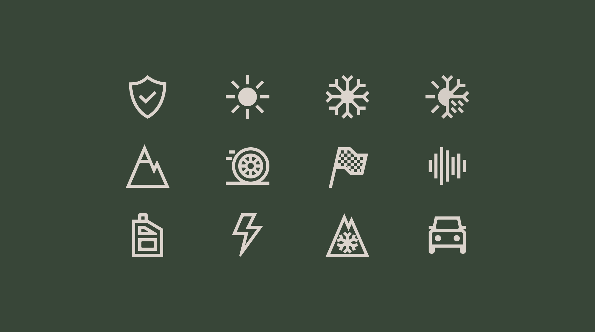
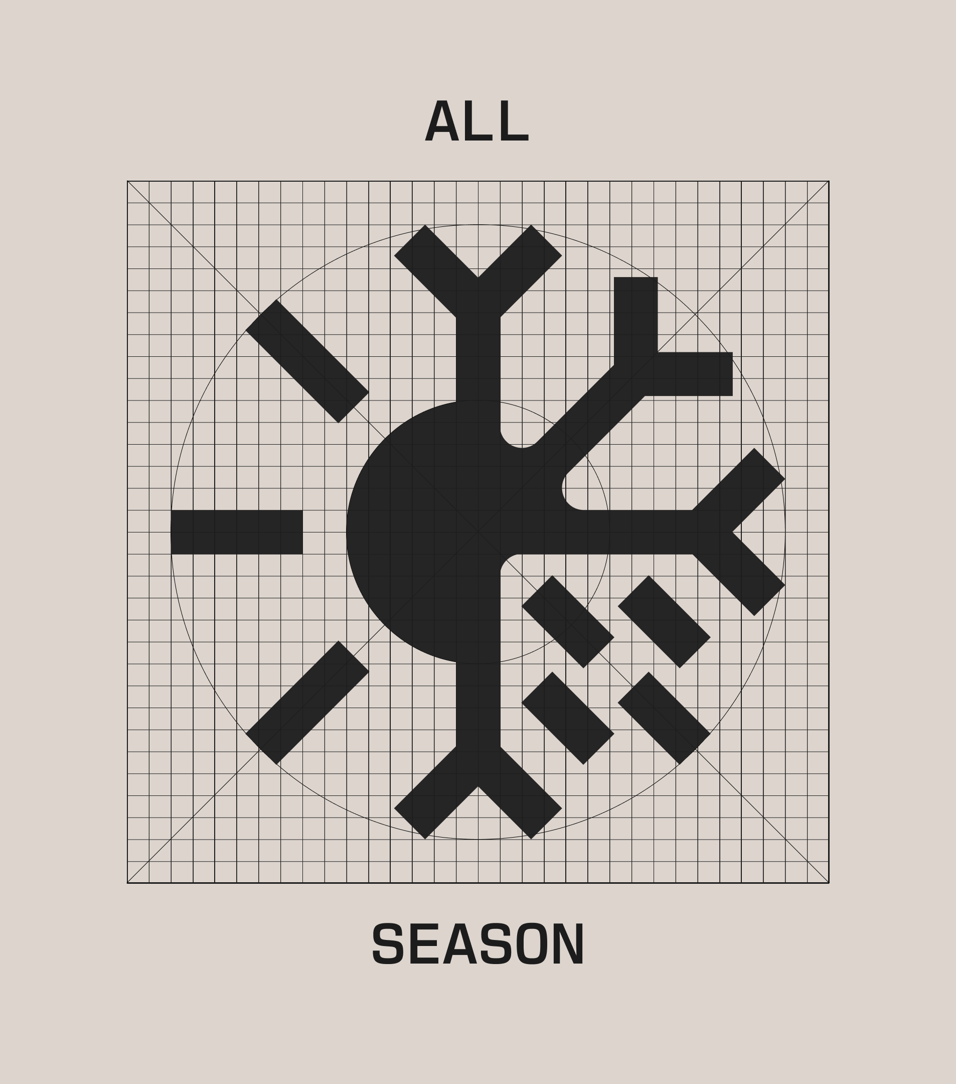
FUNCTIONAL ICONOGRAPHY
Alongside the expressive set sits a functional one, built for utility: wayfinding, product specs, and interface cues that stay legible at a glance and hold up tiny on screen.
The line weights are all the same, and stripped back to its most essential details to read clearly at any size. These icons keep the system usable, guiding people through products and interfaces wherever they need to find their way.
FUNCTIONAL ICONOGRAPHY
Alongside the expressive set sits a functional one, built for utility: wayfinding, product specs, and interface cues that stay legible at a glance and hold up tiny on screen.
The line weights are all the same, and stripped back to its most essential details to read clearly at any size. These icons keep the system usable, guiding people through products and interfaces wherever they need to find their way.
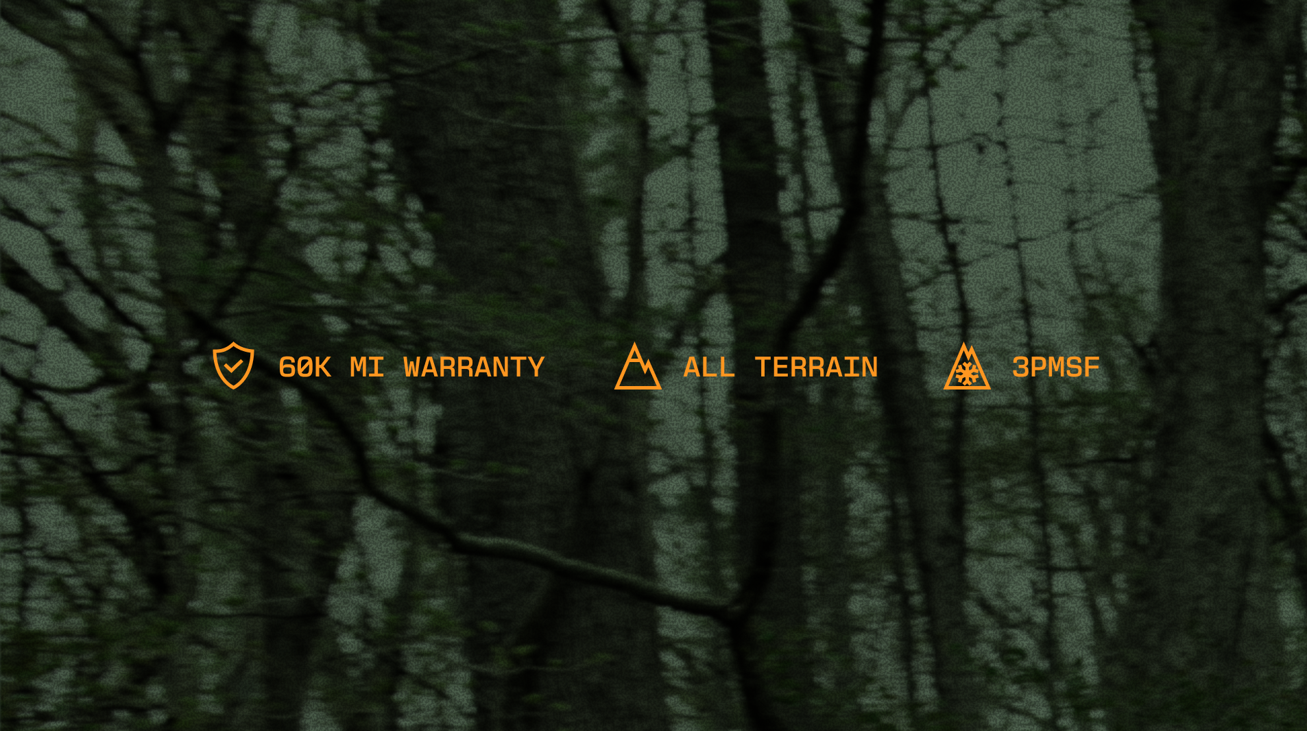
BRAND PATTERNS
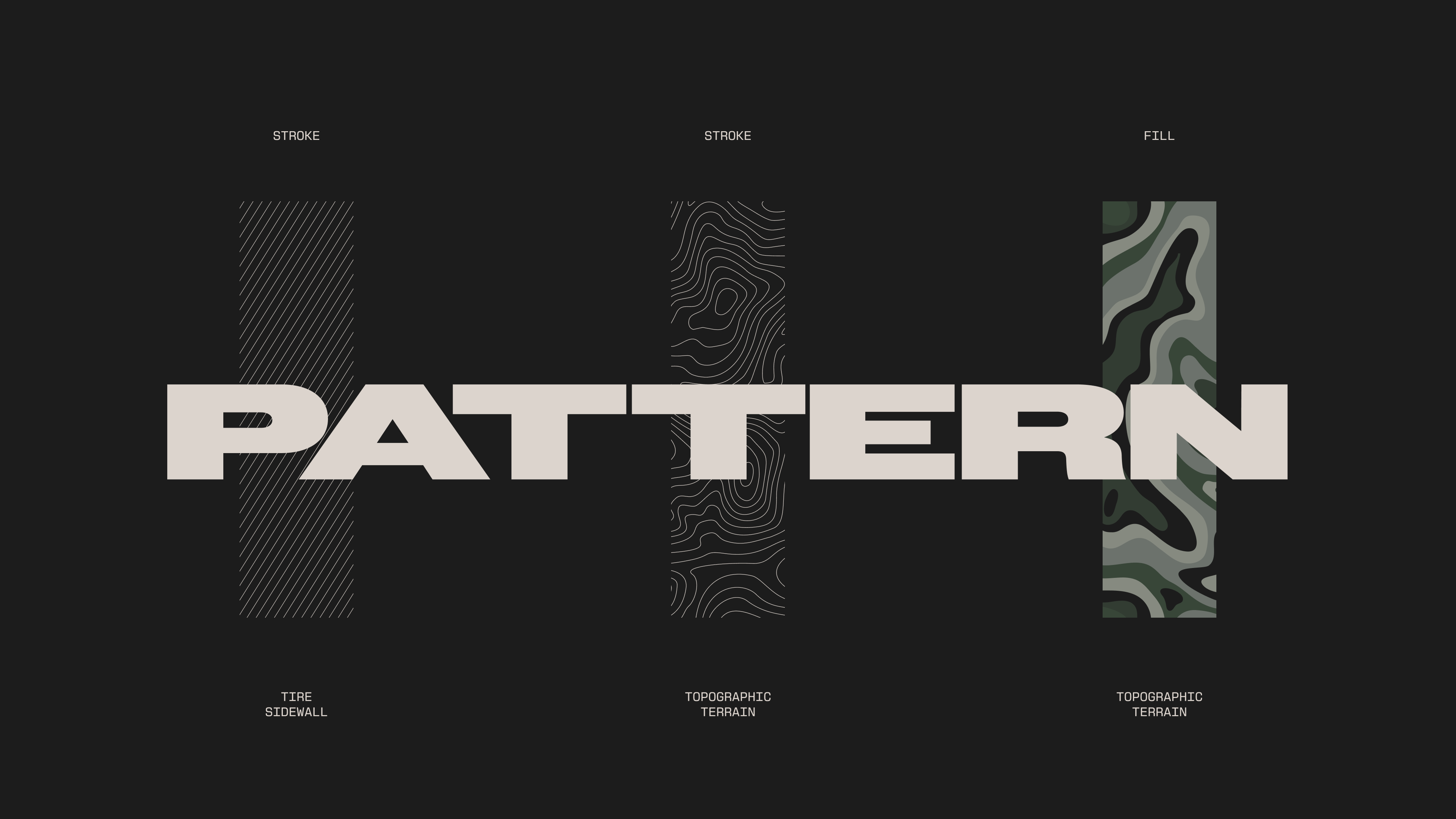
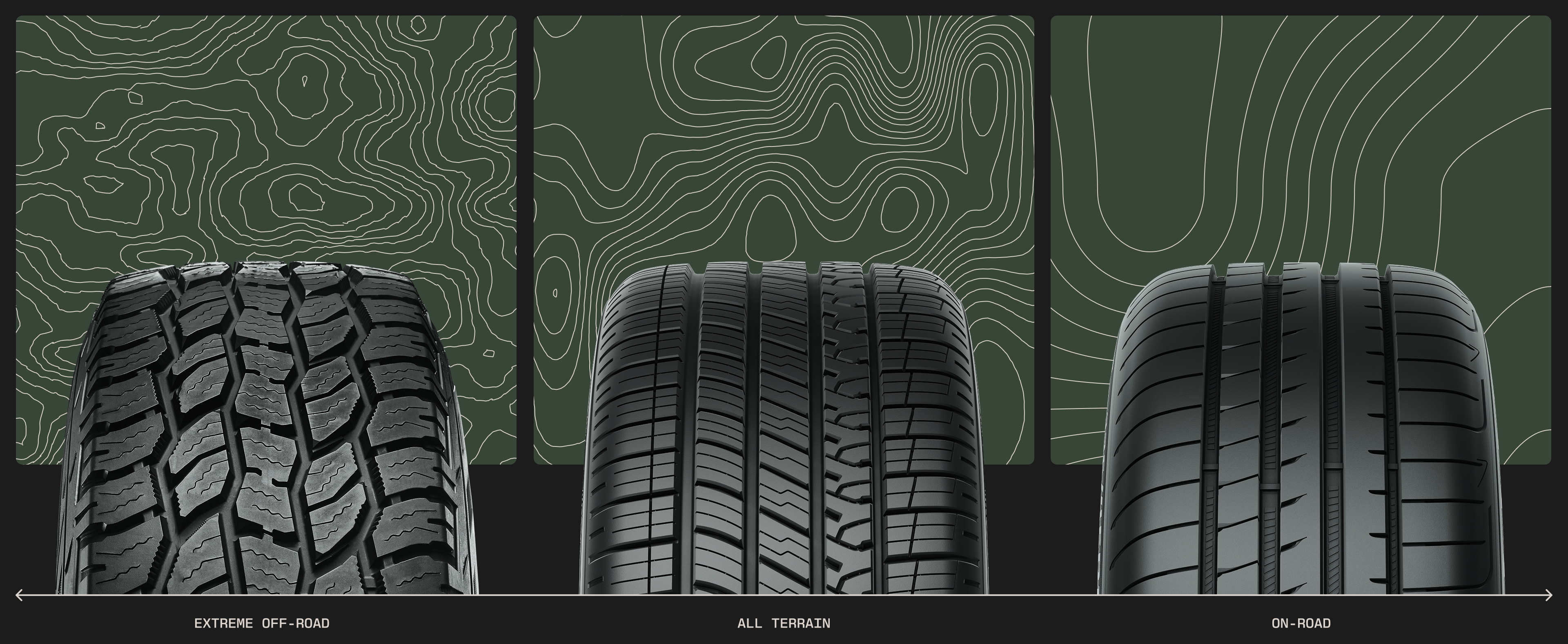
The pattern system was already there, waiting in the tire. The diagonal line work repeated along Cooper's sidewalls became its foundation, expanding into topographic landscapes that map the environments Cooper's tires are built to cross. The more extreme the terrain, and the tougher the tire built for it, the more dramatic the contours become, turning the pattern into a wayfinding cue that helps people navigate the range while signaling what each product was made for.
Fill the space between those contour lines and the same language becomes a bold camouflage, extending the system without adding anything new.
BRAND PATTERNS
The pattern system was already there, waiting in the tire. The diagonal line work repeated along Cooper's sidewalls became its foundation, expanding into topographic landscapes that map the environments Cooper's tires are built to cross. The more extreme the terrain, and the tougher the tire built for it, the more dramatic the contours become, turning the pattern into a wayfinding cue that helps people navigate the range while signaling what each product was made for.
Fill the space between those contour lines and the same language becomes a bold camouflage, extending the system without adding anything new.




THE TIRES
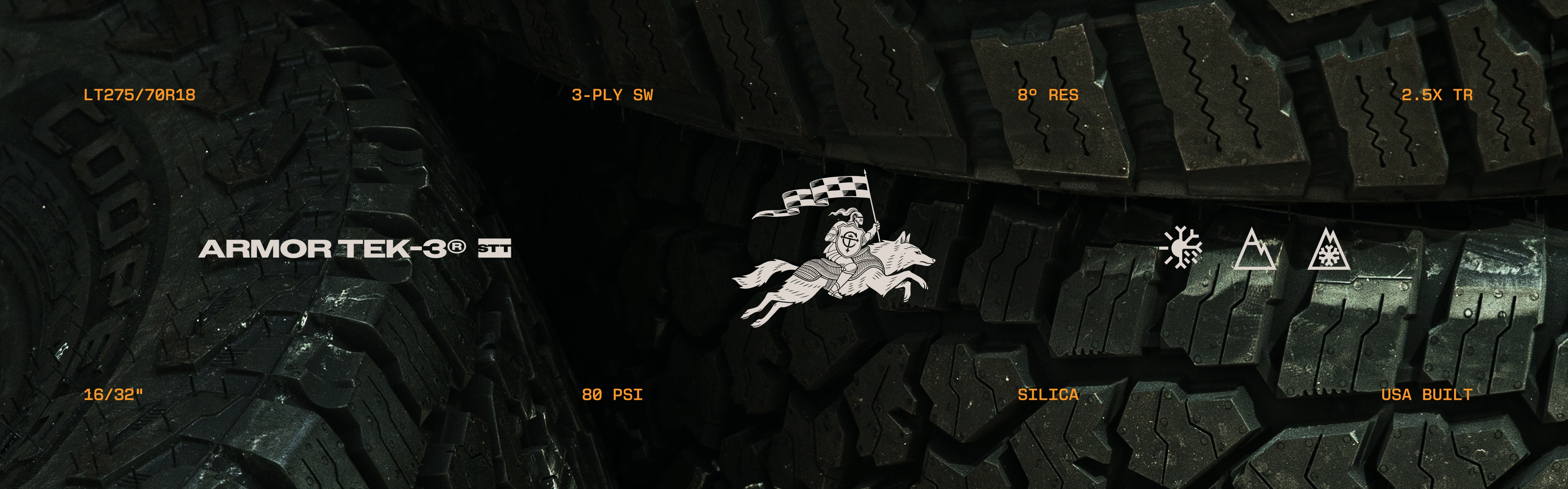
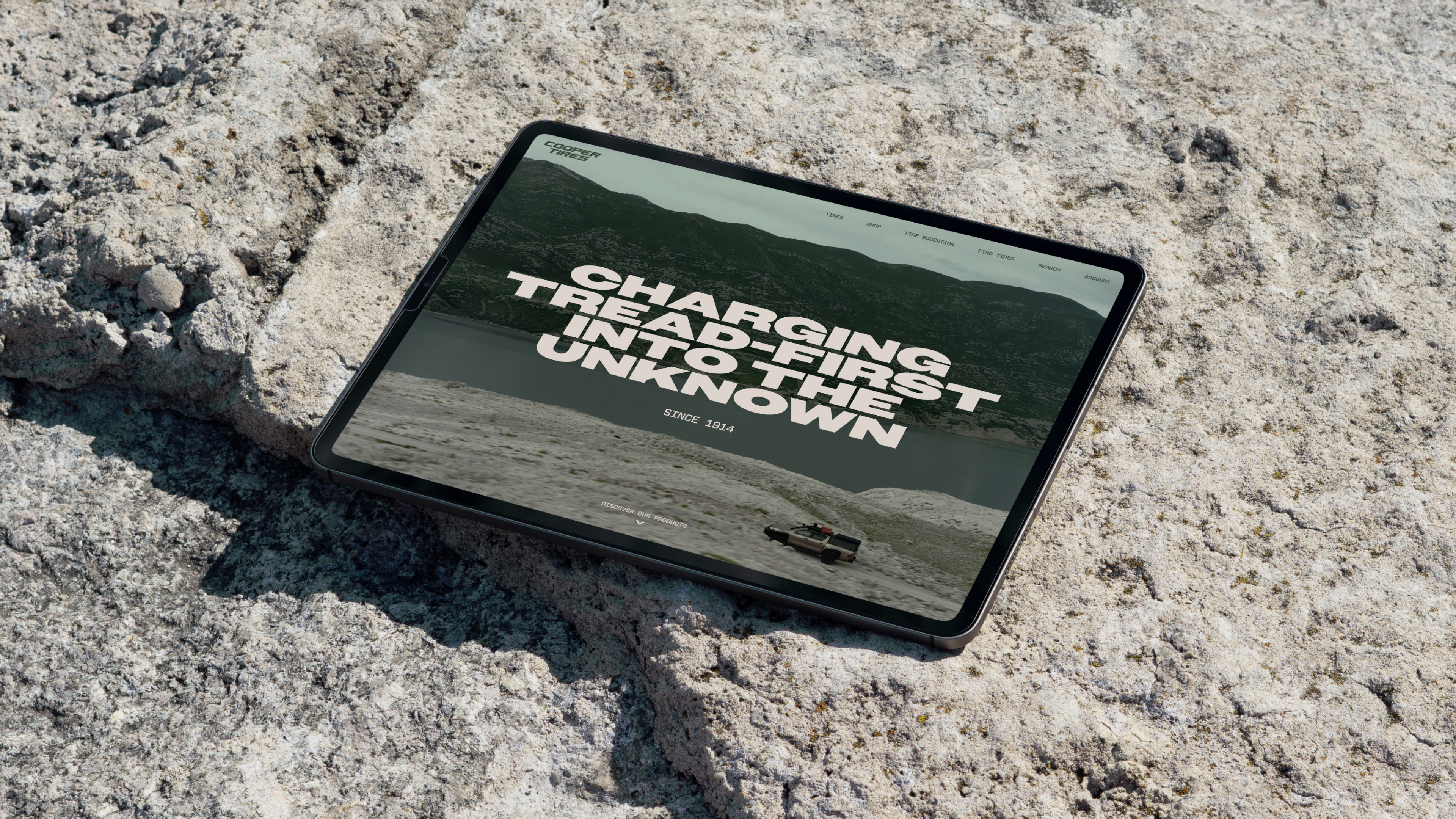
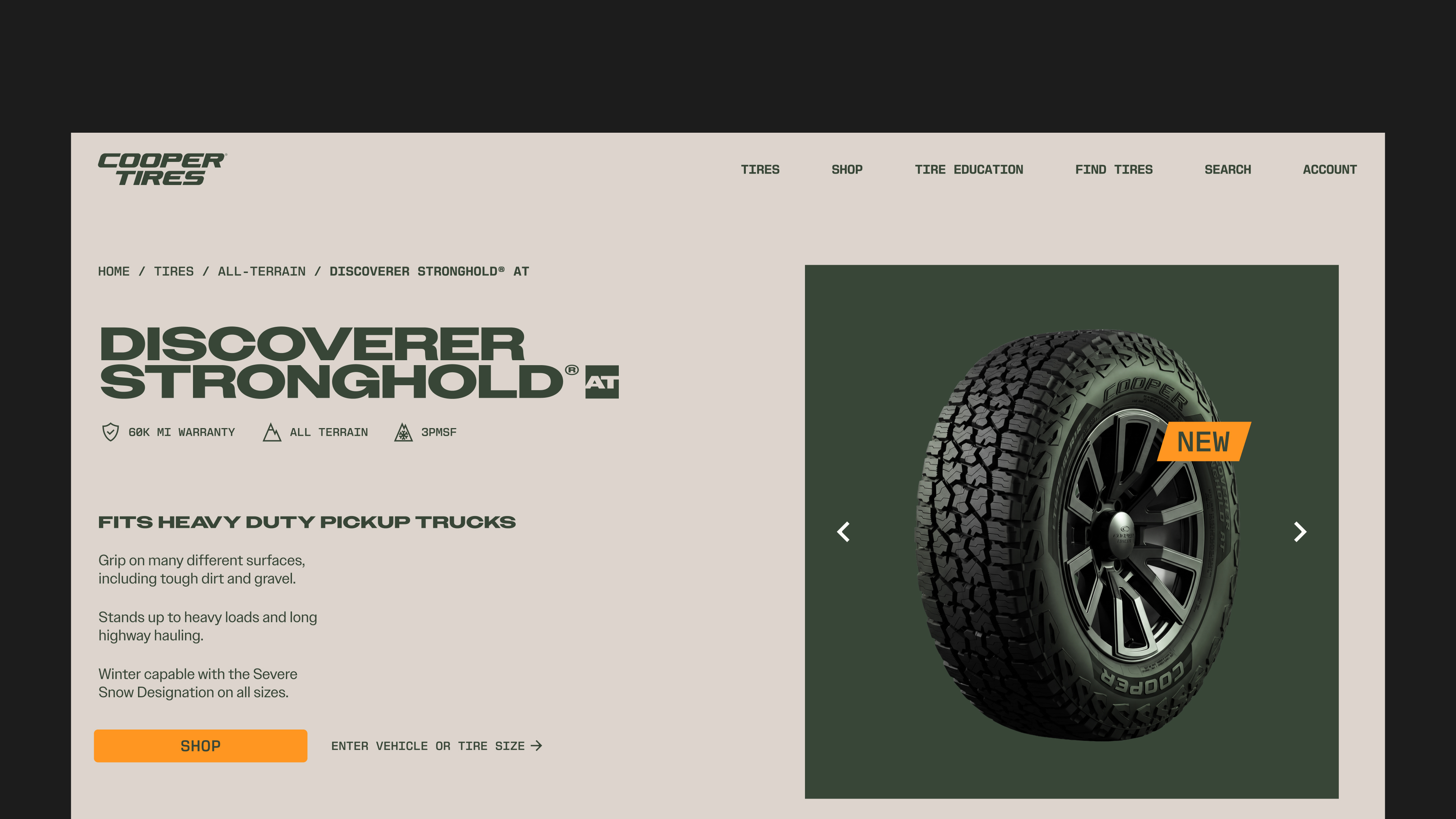
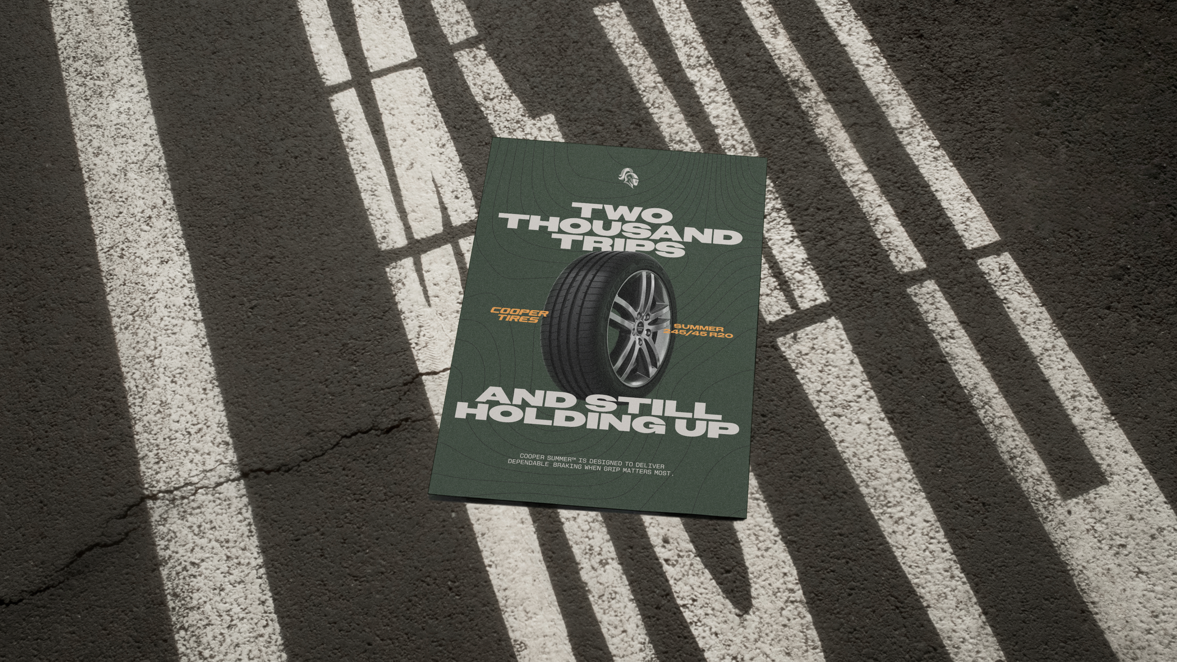
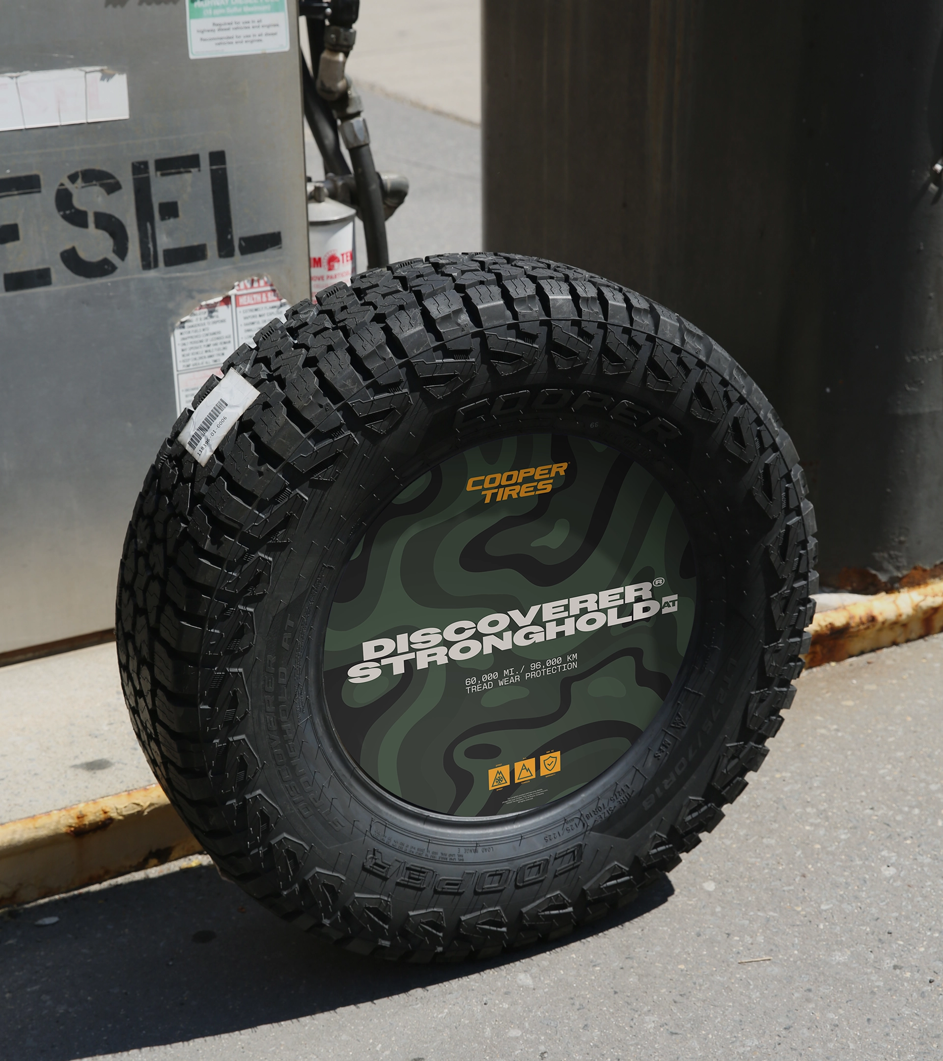
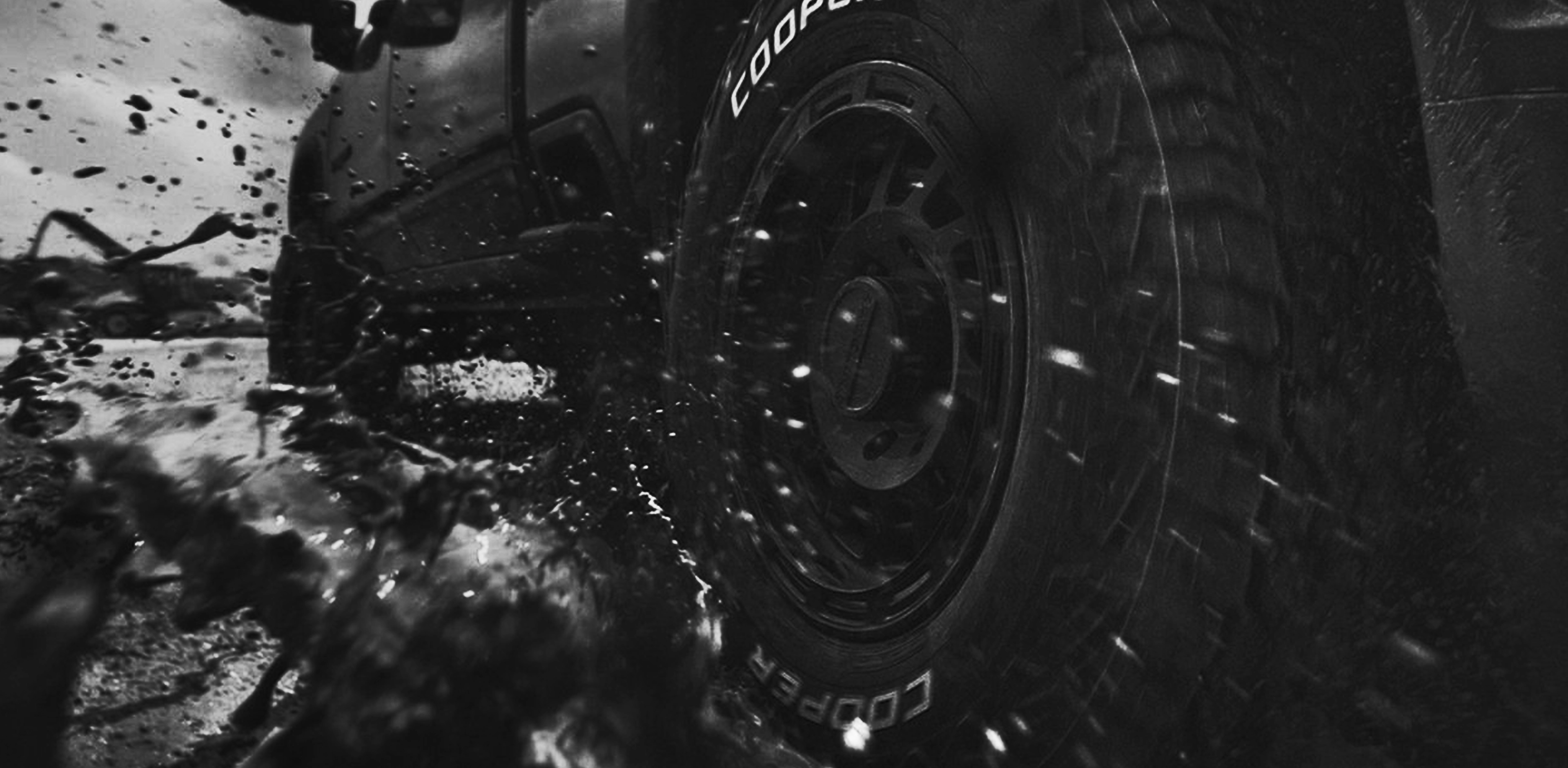
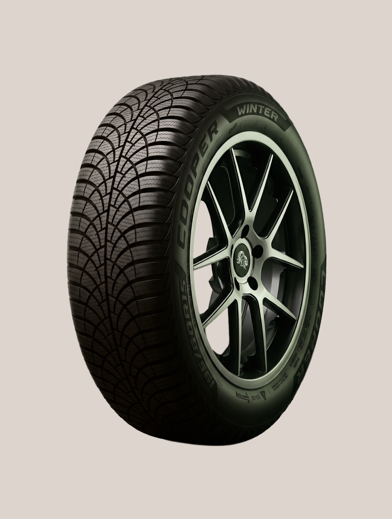
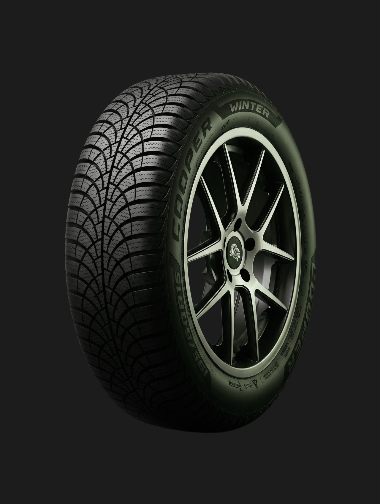
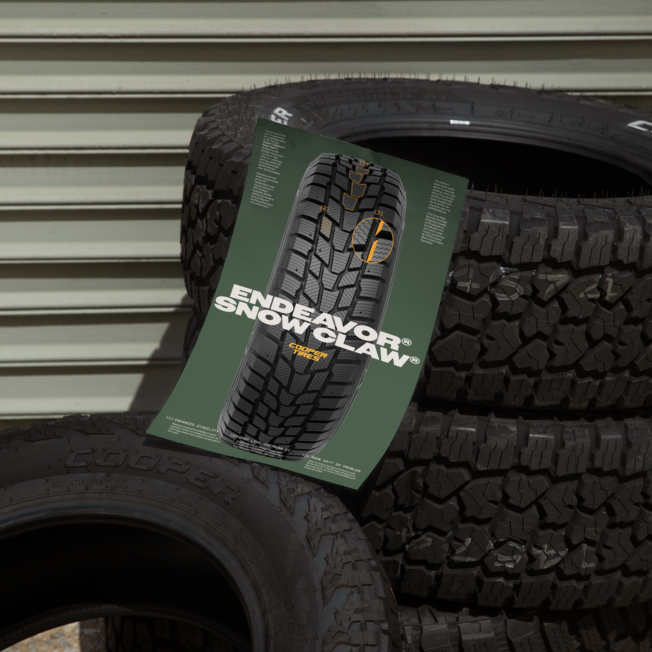
As the heart of the brand, the tire is treated with care across every medium, photographed, rendered, and illustrated, each revealing something different.
The renders use lighting to build brand equity: whatever the background, the sidewall holds Valor Green while the tread picks up the color around it. The photography works at two distances, moving in close to show the engineering in the tread, then pulling back to show the power those tires unleash.
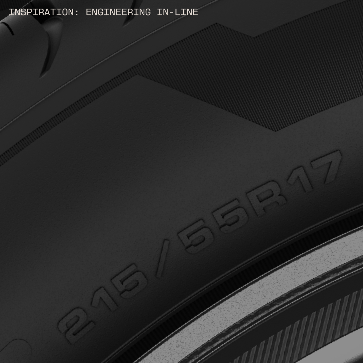
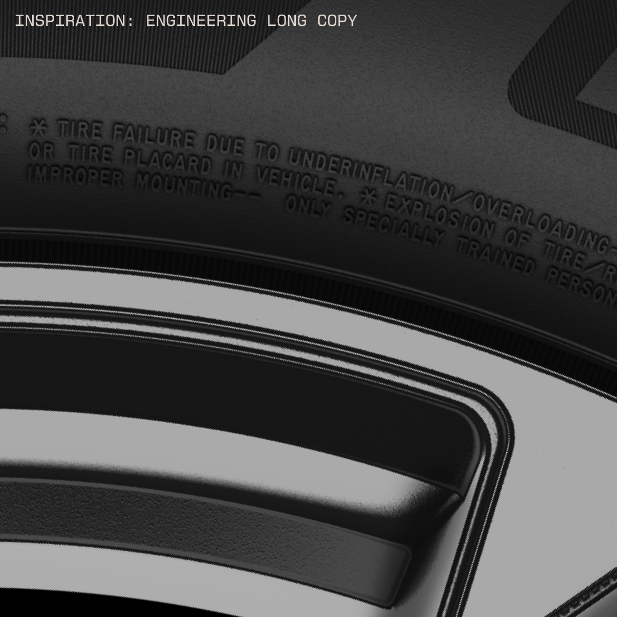
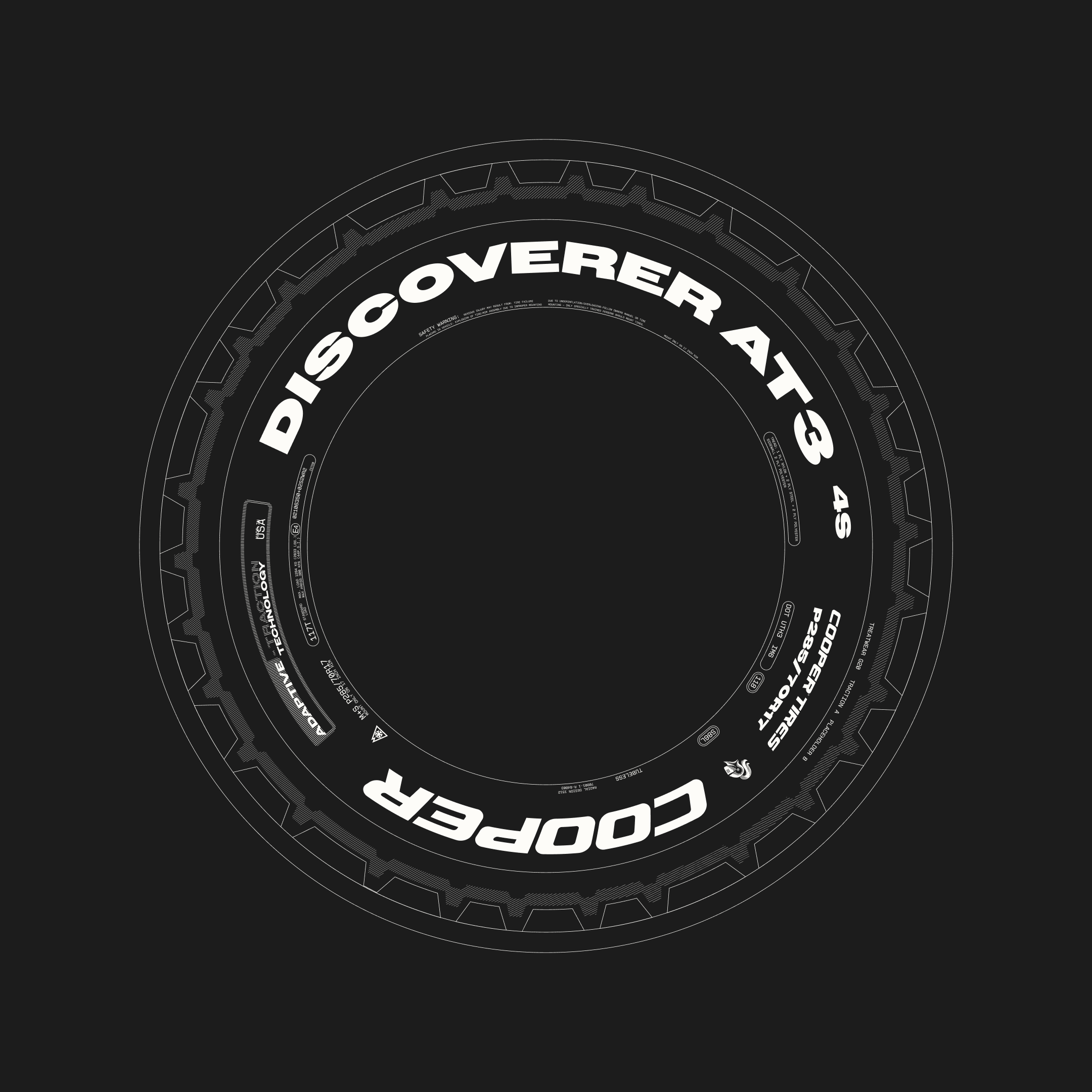
The sidewall itself was redrawn in Owners and New Science Mono, so even the molded lettering reads as pure Cooper. Technical line illustrations draw each tire in precise, moving detail, an extension of the same linework that seen in the brand patterns.
THE TIRES
As the heart of the brand, the tire is treated with care across every medium, photographed, rendered, and illustrated, each revealing something different.
The renders use lighting to build brand equity: whatever the background, the sidewall holds Valor Green while the tread picks up the color around it. The photography works at two distances, moving in close to show the engineering in the tread, then pulling back to show the power those tires unleash.
The sidewall itself was redrawn in Owners and New Science Mono, so even the molded lettering reads as pure Cooper. Technical line illustrations draw each tire in precise, moving detail, an extension of the same linework that seen in the brand patterns.


ALL THE MOVING PARTS
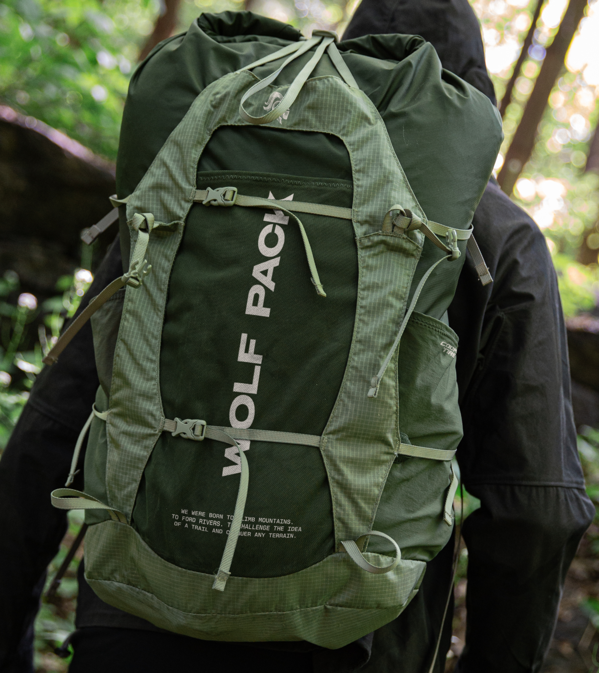
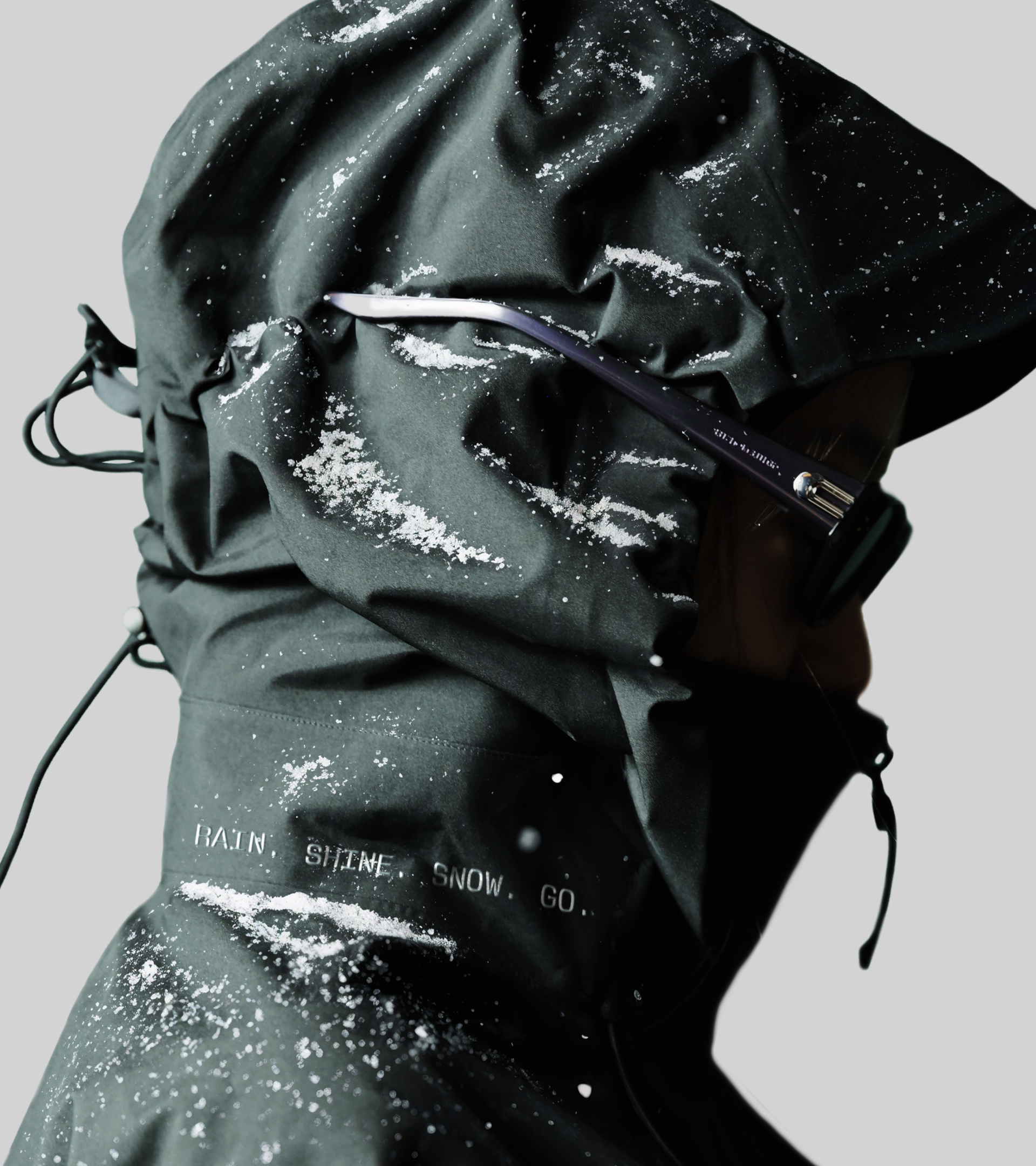
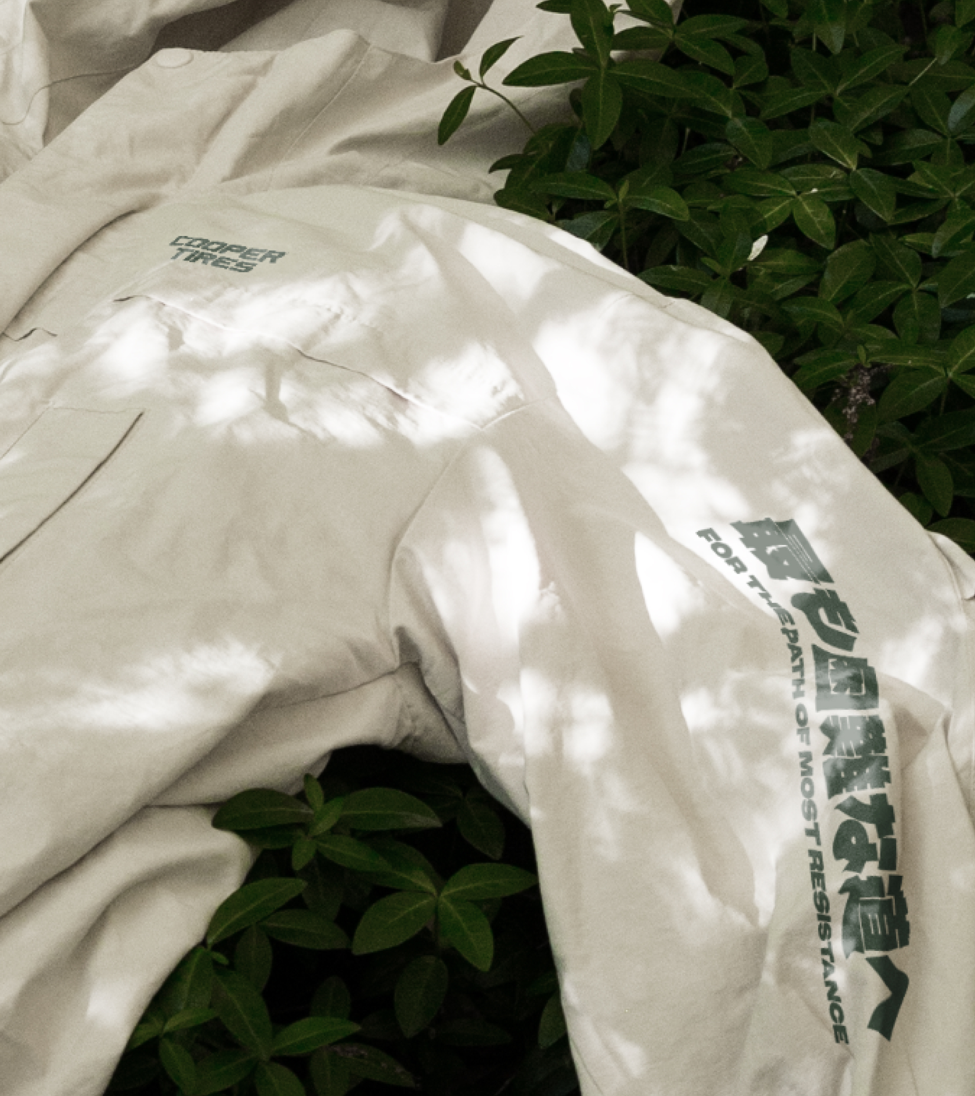
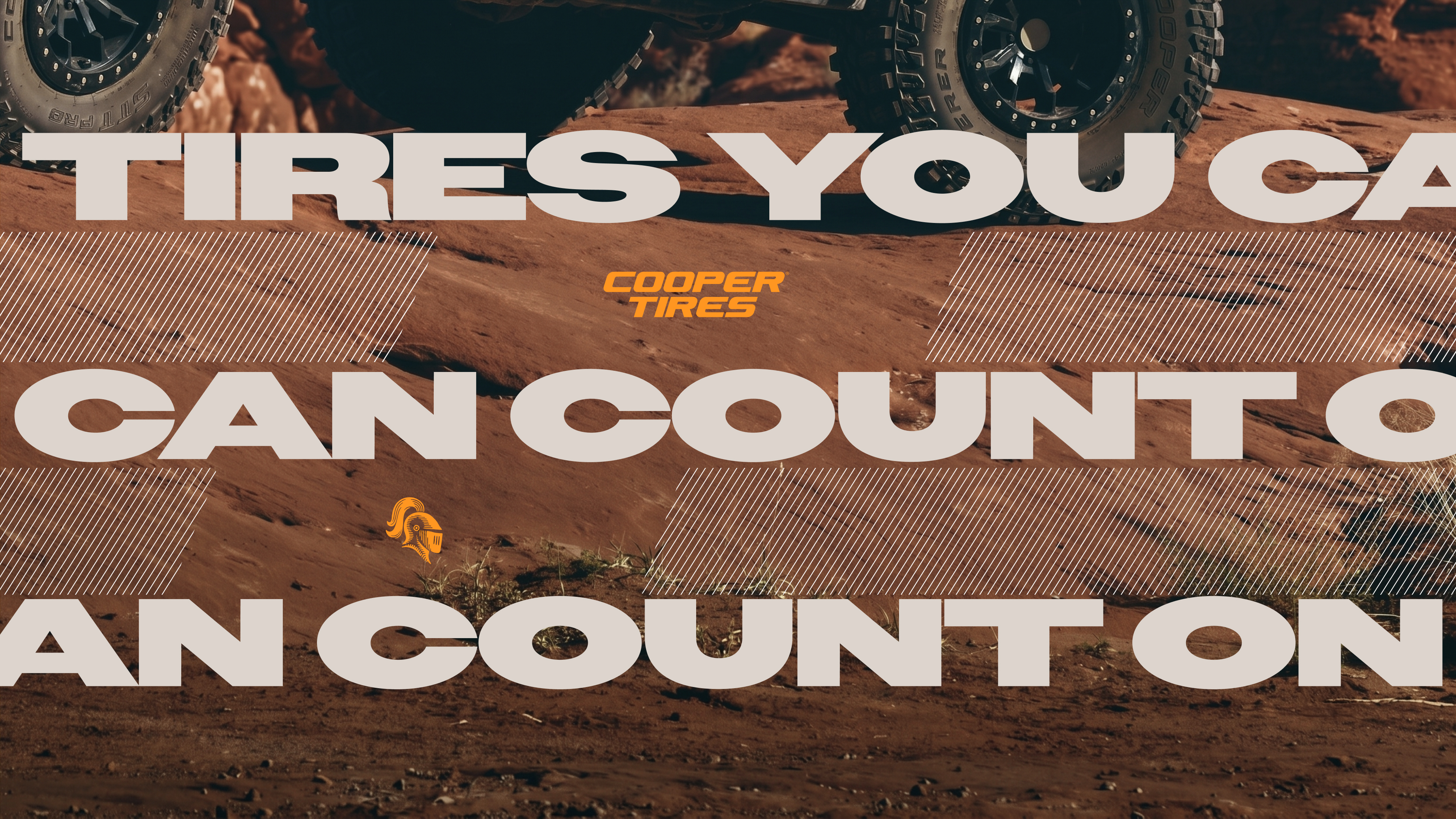
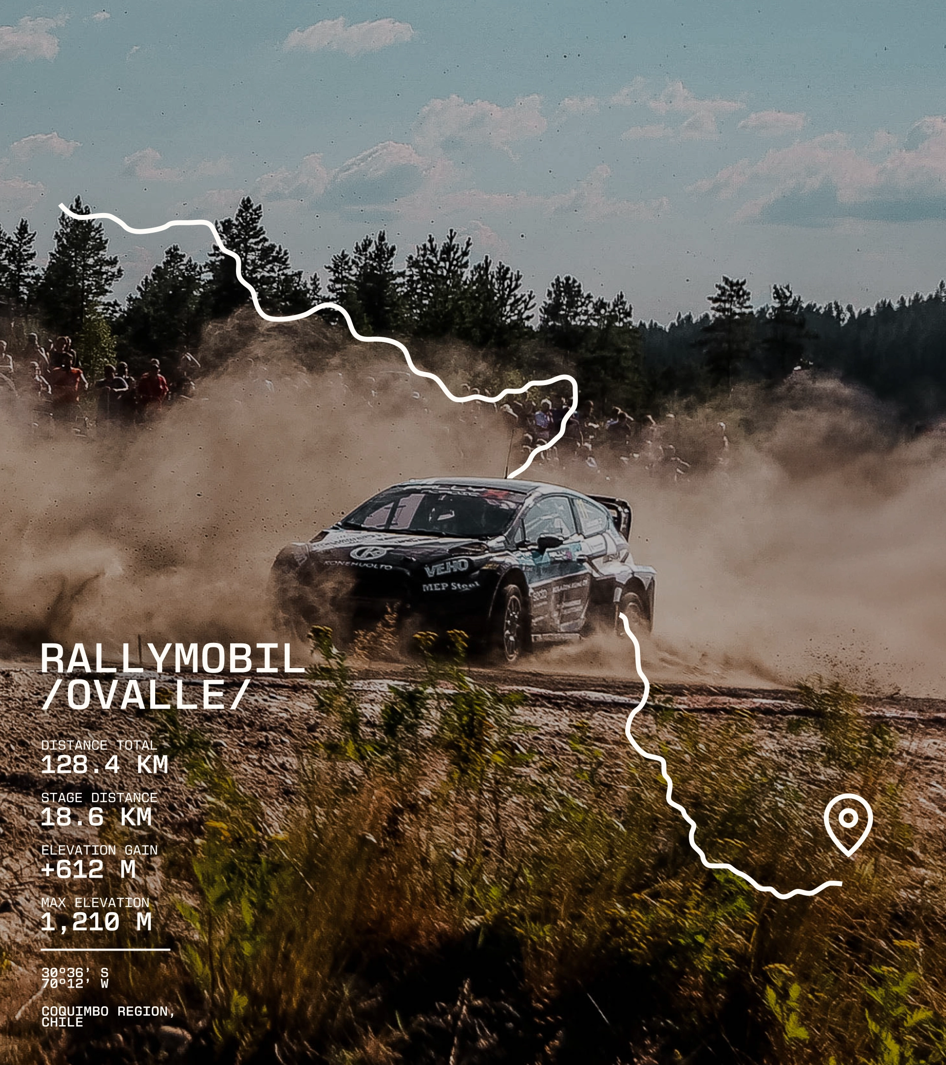
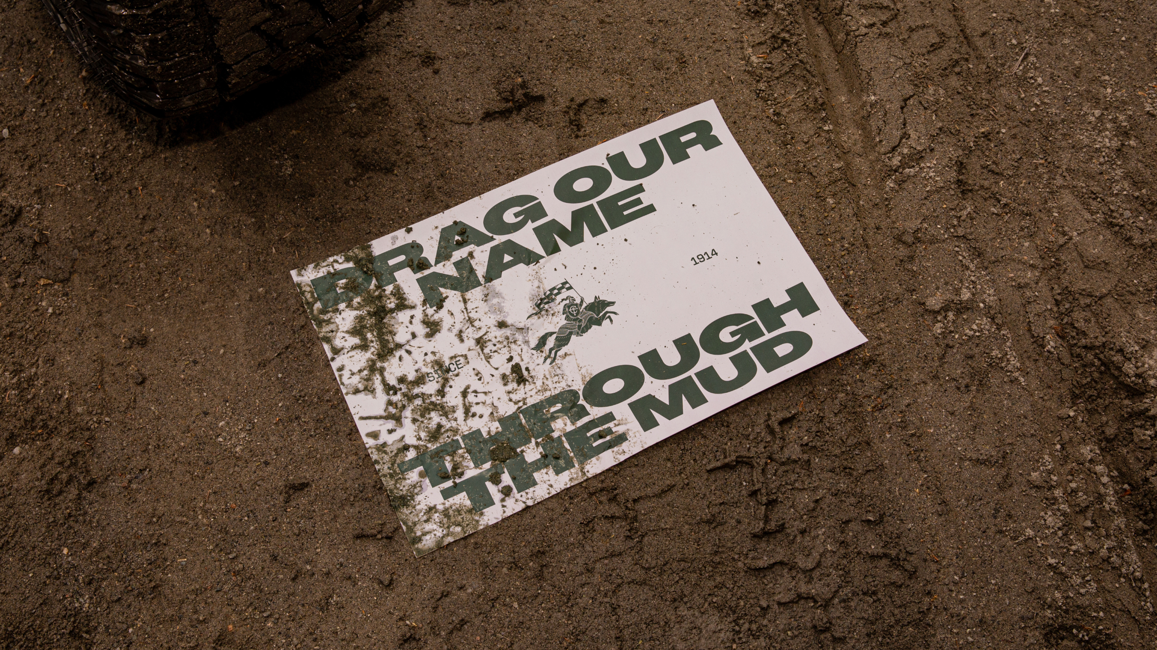
Every part of the brand came from the same place, so every part speaks the same language. The helm and the wolf, the color, the type, the pattern, the icons, and the tire itself all trace back to a single idea: build the brand from the product. What follows is that idea at full scale, across the places Cooper shows up and the terrain its tires were built to take on.
ALL THE MOVING PARTS
Every part of the brand came from the same place, so every part speaks the same language. The helm and the wolf, the color, the type, the pattern, the icons, and the tire itself all trace back to a single idea: build the brand from the product. What follows is that idea at full scale, across the places Cooper shows up and the terrain its tires were built to take on.


Cooper Tires
Branding, Graphic Design, Art Direction, Interface Design, Motion Design, Integrated Brand Tools
—
Cooper has spent more than a century perfecting the industry's toughest tires. The product was exceptional; but the brand no longer reflected it. In a crowded global market, Cooper had started to blend in, and the identity needed to work as hard as the tire.
So we rebuilt the brand from the thing that earned Cooper’s reputation in the first place: the product itself. We led with the toughest expression of it, Cooper’s all-terrain tires, and let that toughness cast a halo across the range. Every decision, from the mark to the type to the color, traces back to the tire, where it came from, where it is, and where it’s going (off the road and into the wild).
A heritage brand, rebuilt from its own product, and made unmistakably Cooper.
Head of Design
Ryan Atkinson
Design Directors
Joanna Durkalec, Flick Eriksson
Designers
Elaine Li, Jin Kim, Adolfo Gutierrez
Illustrator
Marco Palmieri
Animators
Elaine Li, Lucy Hsiung
Visualization
Elaine Li, Joanna Durkalec, Tomas Molla
GCD, Art Direction
Felipe Pavani
GCD, Copywriting
Alanna Watson
Art Directors
Jack Graham, Felipe Pavani
Copywriters
Greg Bruce, Alanna Watson
Client Lead & CMO
Lindsey McNabb Hover
Account Team
Lauren Andreassi, Prerna Agarwal
Strategy
Rik Mistry, Harry Guild, Yewande Adigun
©RA 2009 — 2024
DESIGNER × LOVER × HUSBAND × DAD × GAMER × WEB3 MAXI
JOHANNESBURG 🡒 BAHRAIN 🡒 DUBAI 🡒 SYDNEY 🡒 DUBAI 🡒 NEW YORK
©RA 2009 — 2024
DESIGNER × LOVER × HUSBAND × DAD × GAMER × WEB3 MAXI